Common Cents
End-to-End Application
An application dedicated to budgeting for young adults on their own or with groups.
Role: UX/UI Designer
Tools Used: Figma, FigJam, Zoom, Gmail, Google Drive
Timeframe: 4 weeks
What is Common Cents?
Common Cents is a budgeting app made with the young adult in mind. The app links to the user’s bank account, and gives the user quick and easy glances at their transactions, upcoming bills, and savings goals. Users also have the option to create groups for roommates, partners, or even financial advisors.
Project Goals
The goal of Common Cents is to assist the younger adult budget correctly in this ever changing economy. With today’s economy, the rise of roommates is increasing exponentially. As of 2022, roughly 79 million Americans lived with a roommate that was not their family. The trend of living with a romantic partner before marriage is also on the rise, as roughly 20 million people are living with a partner unmarried. This does not account for the roughly 130 million adults that live together who are married. With the rise in these living trends, especially growing so rapidly from previous generations due to the economy and world situations such as COVID-19, the need for joint budgeting is only increasing.
Timeline
Research
This stage was necessary to understand why users could potentially need a budgeting app, and what features they would want on the app when used. Figuring out the potential competition and understanding the fundamental needs of a budgeting app were crucial when deciding how to go about Common Cents.
Competitor Analysis
Questions: What makes young adults want to use these apps, and how does it help with their budgeting?
Conclusion: These apps have simple wording, easy to read text, and features that draw the user in (budgeting with a partner, subscription management, transactions within the app).

User Interviews and Research
When conducting interviews and research, six people were chosen to be interviewed. Their living situations ranged from living with roommates they dislike or are neutral about, living with friends, living with a partner, or living with a spouse. Ages ranged from 19 to 63. Having this wide range of ages and living situations allowed for many people in different life stages to give input into how they budget alone or with their partner and why.

Key Findings
People under the age of 28 tended to not budget well or at all.
People living with roommates have a harder time sharing their smaller things that would save money in the long run (subscriptions, groceries, decorations).
People living with couples tend to split things based on income, rather than down the middle.
People living with their spouse tended to have 1 person handle almost all or all of the finances.
It’s common practice for married couples to use joint bank accounts.
Most tried to budget using Excel or Google Sheets, but quickly abandoned it.
Research Synthesis
Synthesizing the research through visual cues was very helpful to the process. Creating personas based on people interviewed and found during research, as well as creating POV/HMW statements, led to a better understanding of the future of this budgeting app. It is here where I decided to create an app more focused on personal budgeting, with an option for group budgeting while keeping the option very accessible.
Personas
Two personas created to demonstrate the different clients that use budgeting apps, as well as demonstrate different pain points people can have based on age, income, living situations, and social dynamics within those living situations. Winston, the 35 year old husband, has a joint bank account with his wife. He finds budgeting between them to be very difficult, and can’t figure out how to manage it all. Emma, the 26 year old busy bee, is too preoccupied with work and saving to be worrying about her roommates sending her the money for their bills on time. She needs something that can help her track who has contributed to what for rent and bills, so she can focus on herself.
Winston, the 35 year old husband.
Emma, the 26 year old busy bee.
POV Statements
Statements that are formulated with the intent of discovering the user’s pain points from their perspective.
I’d like to explore ways to help frustrated roommates budget well together, because it can be difficult to understand how to budget correctly with other people.
I’d like to explore ways to help confused adults understand how to use their money well, because it can be difficult to understand complex topics and jargon related to money and budgeting.
I’d like to explore ways to help new couples budget and live together, because money can strain a new relationship in a serious way.
How Might We Statements
Statements that are formulated with the intent of discovering potential ways to solve pain points found in the previous POV statements.
How might we allow frustrated roommates to live together cohesively while budgeting together properly and smoothly?
How might we help confused adults save correctly and understand complex topics regarding budgeting and saving?
How might we help new couples keep their relationship strong by creating a smooth and easy budgeting tool for them to use and share?
Branding and Planning
Through the branding and planning stage, the concepts for the app were easier to visualize. The creation of the sitemap led to the conceptualization for how the app will be laid out, while the flows helped understand what pages should be created for this specific study and future testing. Creating the brand itself helps give a more tangible feeling to the app, rather than it being a concept with research backing it up. It is now the beginnings of a new app.
Sitemap
Some key features added to the Common Cents sitemap include:
Manage Roommates page to manage groups, roommates in the group, and goals within the groups.
Budgeting page that allows the user to view their banking information and budgeting information, including tips and advice.
The transactions page will allow the user to search transactions and view their spending habits in one spot.
User Flow
User flows show a step-by-step process of how a user would go through a flow on a website, and includes all paths possible.
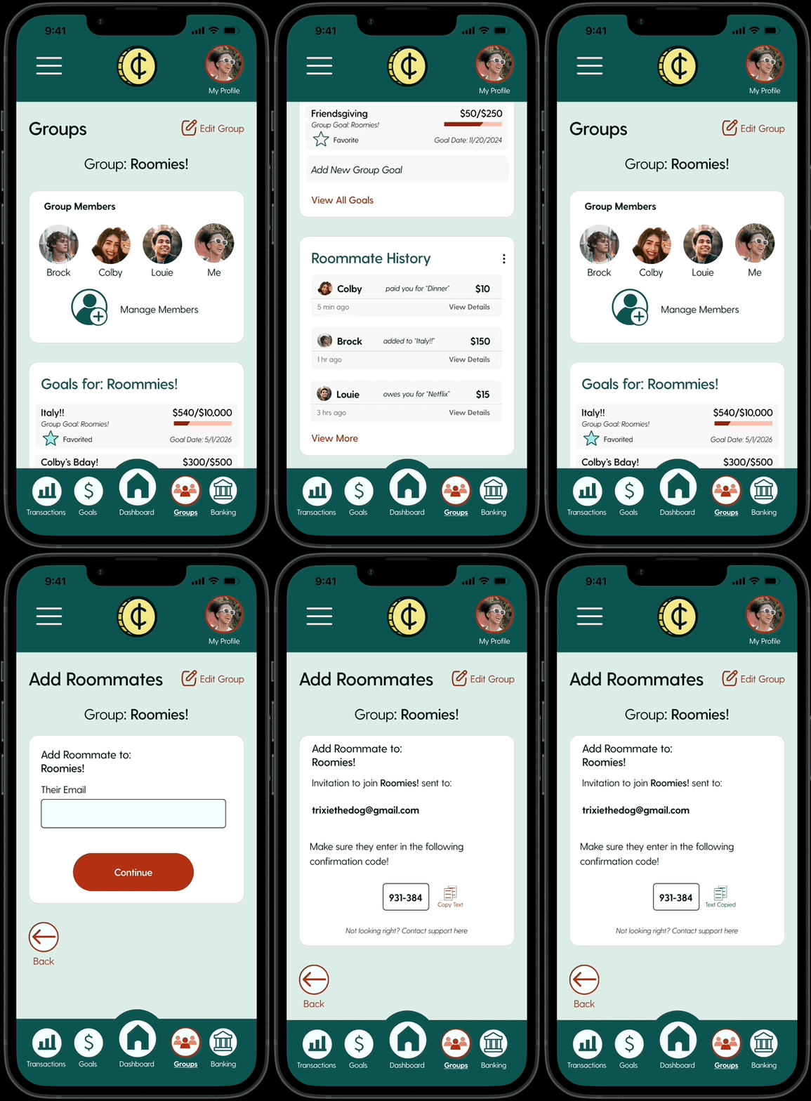
The scenario given for this flow: You are living with your 3 roommates, and you’re expecting to get a fourth roommate, Trixie.
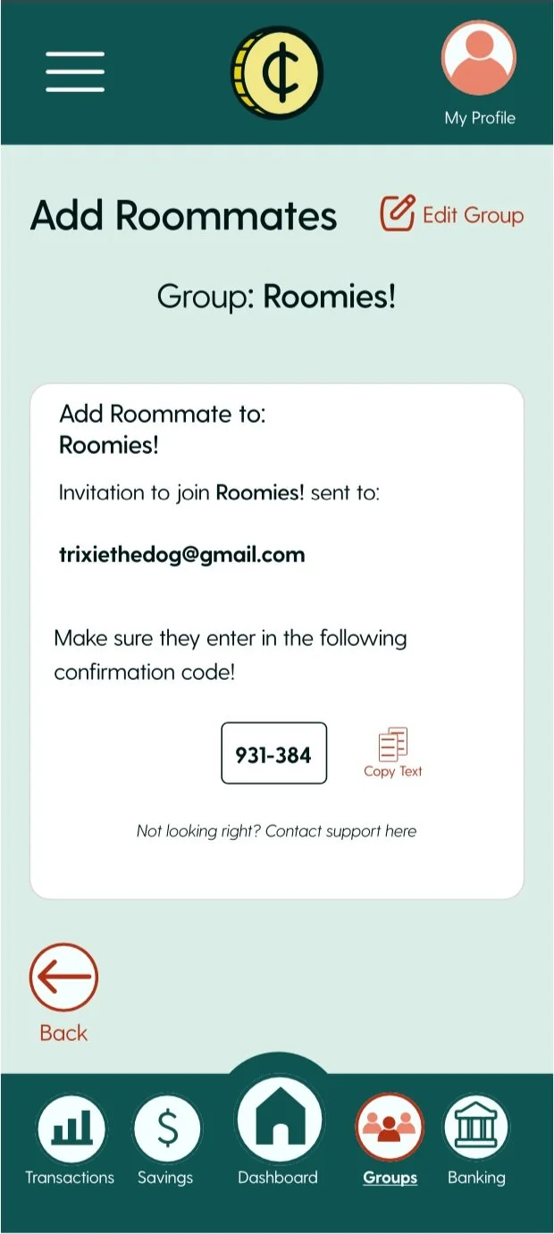
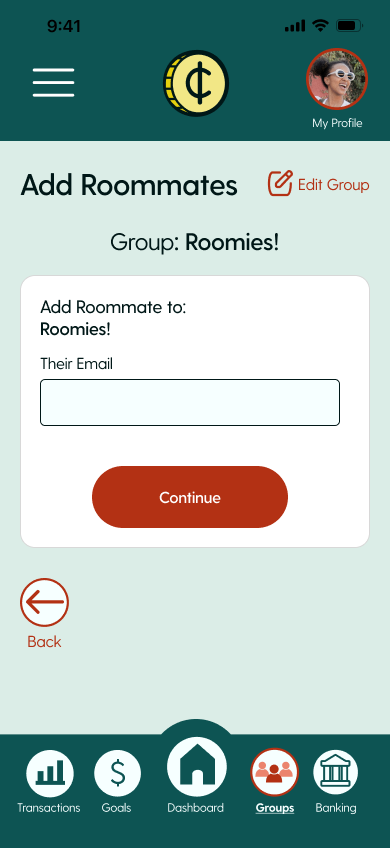
This user flow shows the user navigating from the opening screen to the roommate page, adding a roommate, and sending an invitation. This was chosen as a flow due to the different pages having to be navigated, as well as the different interactions (text boxes, buttons, tabs, etc.)
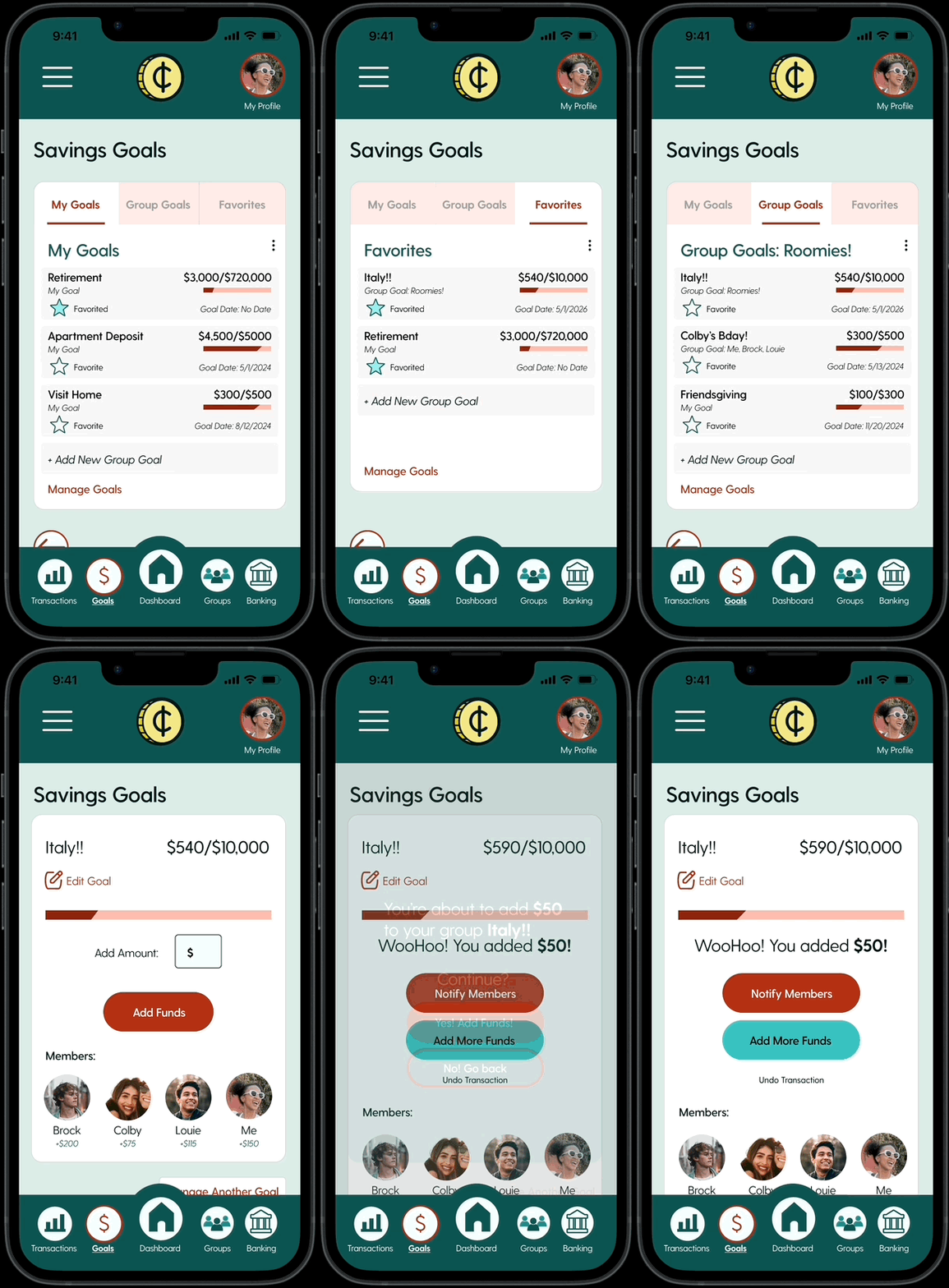
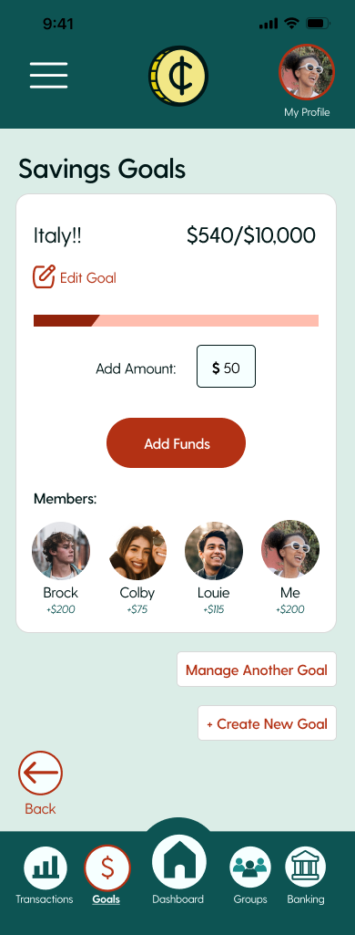
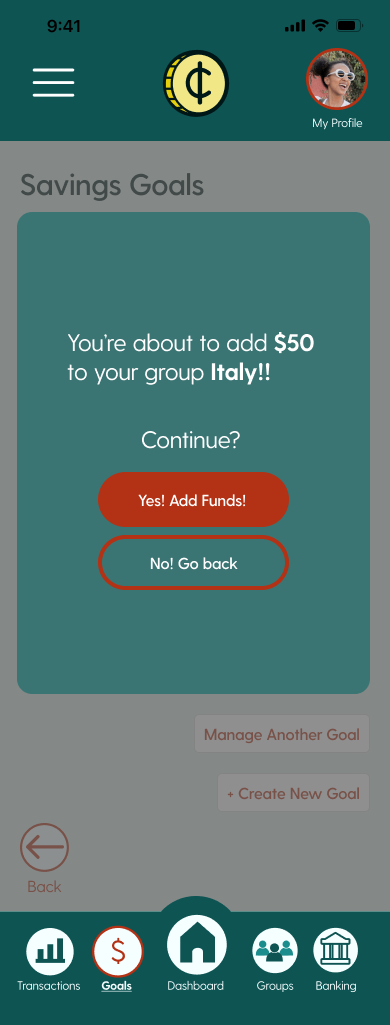
The scenario given for this flow: You’ve just realized you have an extra $50 and you want to add that to your Italy budget.
This user flow shows the user navigating from the dashboard to the goals page, adding to a goal, and confirming the addition. This was chosen because it involves the user navigating the software’s prompts, as well as finding the goal that is found by navigating the app.
Branding
Mood Board
The goal of this mood board is to show real life and hypothetical ideas for the layout, colors, and style of the app Common Cents. Neubrutalism and more modern styles were big inspirations for this app, as the target audience is young adults.
Style Tile
The style tile took inspiration from the mood board’s design and color palettes. The green and dark teal colors stood out in a trusting, growing way that budgeting apps try to capture. The font was chosen because its style is easy to read and modern, so it can be eye catching to the users without being difficult to understand.
Feature Set
The feature set shown is sorted into four categories, showing what should be added to the app and what can wait to be added. This conclusion was created by user interviews and research, as well as preliminary research.
Icons
The goal of the icons was to make them easy to see and understand without the title. Thick lines, simple blocks, and universal symbols were used in order to increase visibility and knowing. The main green color of these icons are the regular state, while the red icons are when they are selected. The only exception to this is “Copy Text”. The main color of this icon is red because it requires the user to see it amongst other images and icons on the page.
Logo
The concept of the logo was for it to be simple while incorporating the idea of either the C’s or a coin due to the name Common Cents.
Some problems faced with these concept sketches were as follows:
Keeping the logo easy to recreate.
Making sure the logo is not too muddy when scaled down.
However, the biggest issue I kept running into was making sure it did not copy the Comedy Central logo too much.
The final version of the logo ended up being the coin, because it is unique, simple, and gets the idea across. Additionally, at any size it can be read well.
Design and Testing
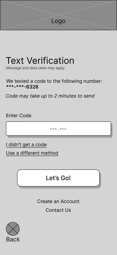
The design and testing phase was done in order to test the layouts of the app, and learn from testing. Low, mid, and high fidelity wireframes were created, and only the mid and high fidelities were tested. With the research and branding in mind from the previous phases, a blueprint and multiple iterations can be created, tested, and completed.
Low Fidelity Wireframes
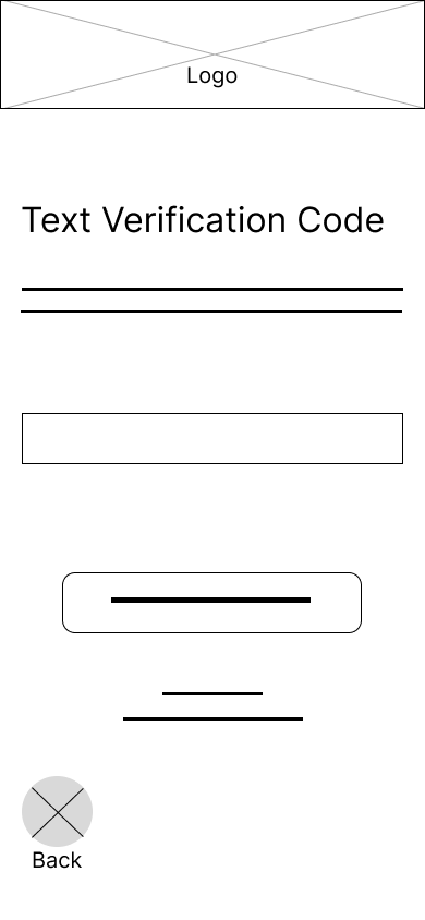
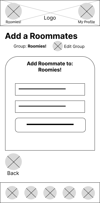
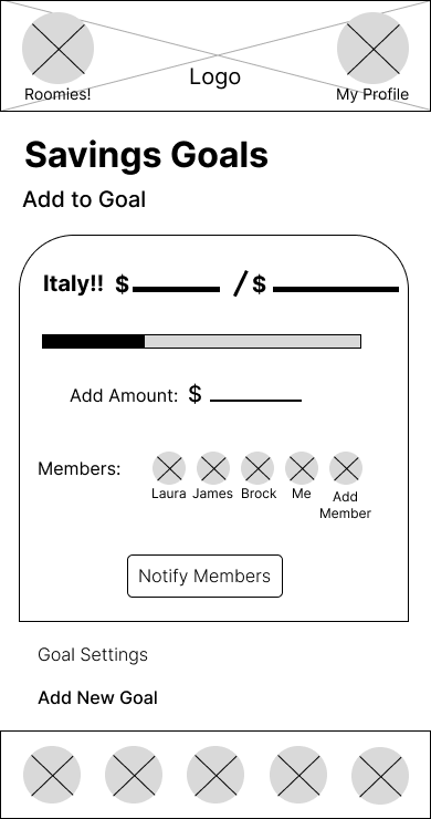
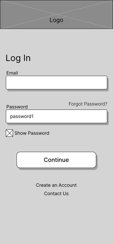
The low fidelity wireframes were created as an iPhone 14 application layout. The goal of these wireframes is to create an app with the intention of ease of access, information, and trust. Click arrows to scroll through wireframe pages.
Mid Fidelity Wireframes
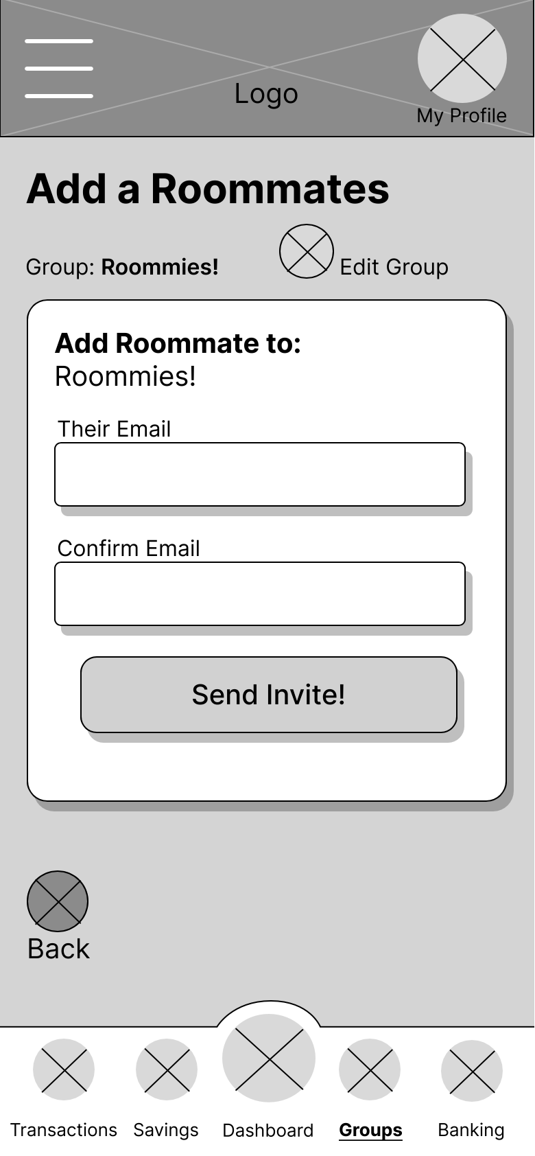
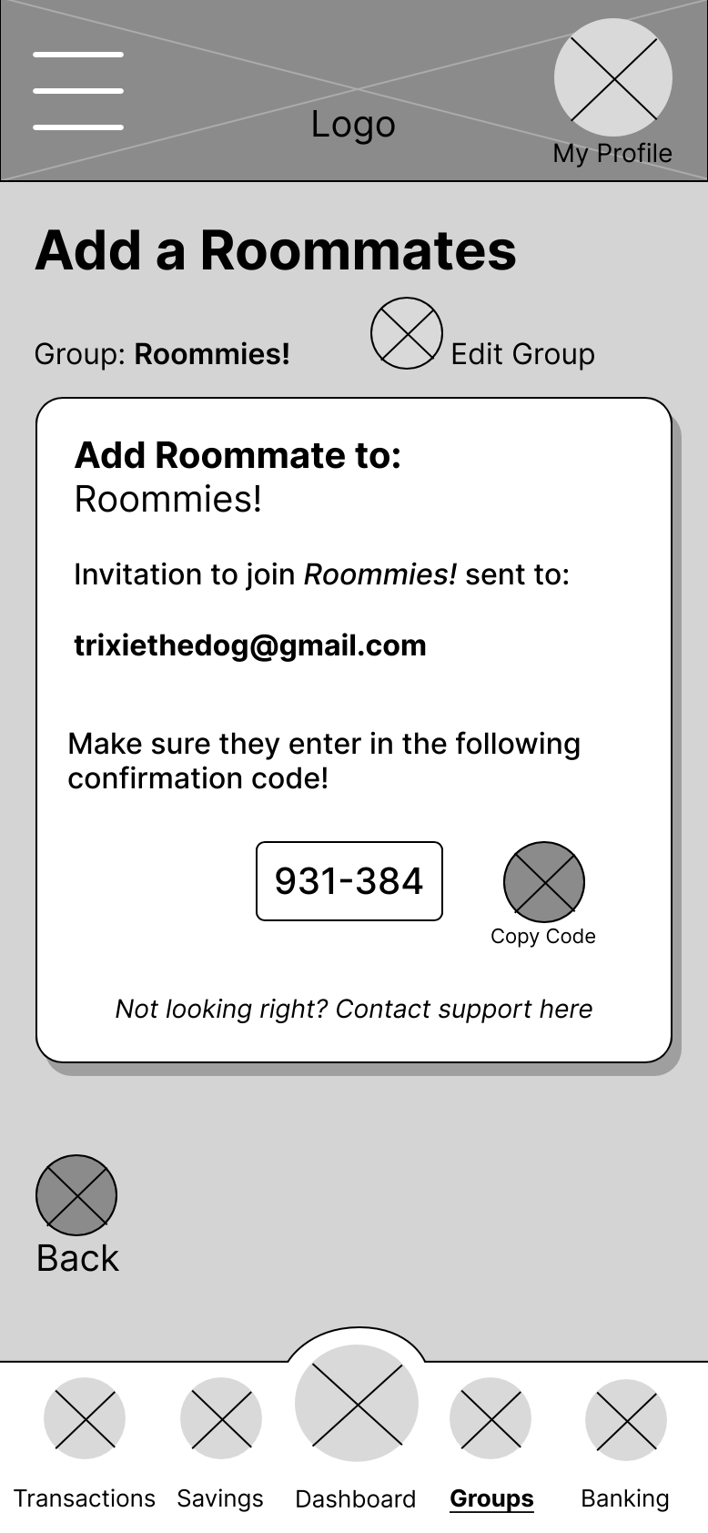
Many iterations were created between the low and mid fidelity wireframes. The look of the features as well as the complexity of the information listed give the wireframes more of a feeling of an app, rather than an idea. These were created with the knowledge that they were to be tested with potential users. Click arrows to scroll through wireframe pages.

Usability Testing- Mid Fidelity Wireframes
For these usability tests, five participants were selected. Their ages ranged from 25-63. Users were given two scenarios to navigate, and were interviewed about the flows after completion.

Key Findings
Users found the tasks to be simple and quick to complete.
Users gave very helpful feedback and advice on how the features should be displayed from their experience.
Present more details about transactions.
“I think it would be nice to see what the transactions were for. Like, was this for rent? When was it sent? I think that would be easier to understand.”- Laura, 63, lives with spouse.
Show visual goals and contributions.
“It would be easier to see if there was that graph or something here… What if there was a way to see how much each person contributed so you can tell who is lacking and how much you’ve given versus them?” - Zayne, 26, lives with girlfriend.
Notify Members CTA placement.
“Oops! I just clicked notify members before adding. (Laughs) That might be better on the next screen instead of being available here.” - Ally, 25, lives with roommates.
High Fidelity Wireframes
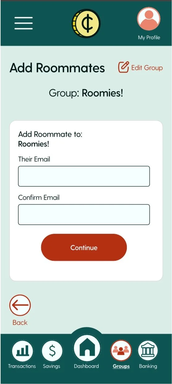
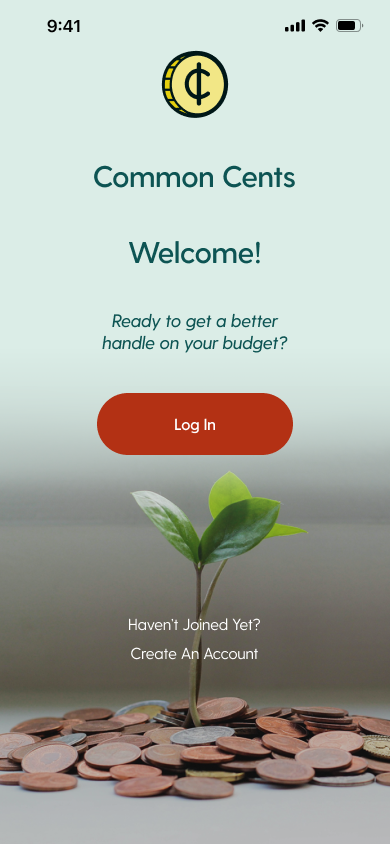
The high fidelity wireframes, with the branding ideals in mind, were created to make sure the user has an easy time navigating what can be seen as difficult to understand information. The additional tabs are now accessible through tap, not swipe, to reduce user error. Keeping the background as the lighter green, while the accents are the darker green or the red, allows the user to feel a sense of ease, adventure, and growth. Adding a landing page gives the user a beginning, rather than being forced into a log in prompt.
Usability Testing
Similar to the mid fidelity testing, I conducted usability tests with five different people aged 25-63. Participants were given the same scenarios, and asked to complete the same flows. After completion, participants were asked questions regarding the UI and flows tasked to them. Results and findings can be found below.
Key Findings
Users found the tasks to be simple and quick to complete.
Users responded positively to the color palette, logo, and icons.
Users liked the interactions and layout of the app, saying it was easy to use and navigate.
Iterations
Iteration 1: Profile Icon
Originally, the profile icon was just the icon. Now it is the main user’s profile picture. The user’s profile picture is seen in other places, including the Groups page, so it makes sense that it would represent their profile instead of an icon.
Before
After
Iteration 2: Savings Title
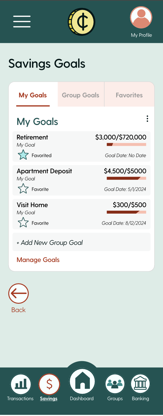
The tab containing savings goals was called Savings, but users found it difficult to find their goals. It has been changed to Goals to ease the confusion.
Before
After
Iteration 3: Funds Confirmation
To avoid user error, there is now a confirmation for adding funds to any savings goal. This helps eliminate user error, as it makes sure the user doesn’t accidentally enter in the wrong amount of money to the wrong group.
Before
After
Iteration 4: Add Funds
The Add Funds box now matches the UI of the rest of the app with the removal of the drop shadow and centering of the text.
Before
After
Iteration 5: iPhone Header
For immersion purposes, an iPhone header was added to the top of the wireframes. This allows for prototyping to be more accurate, as well as gives more space to the design to accommodate the header.
Before
After
Iteration 6: Confirm Email
There is no longer an email confirmation prompt when inviting a member to a group, as it was found redundant. The next page asks the user to share a code, so confirming an email is not needed.
Before
After
Iteration 7: Member Contribution
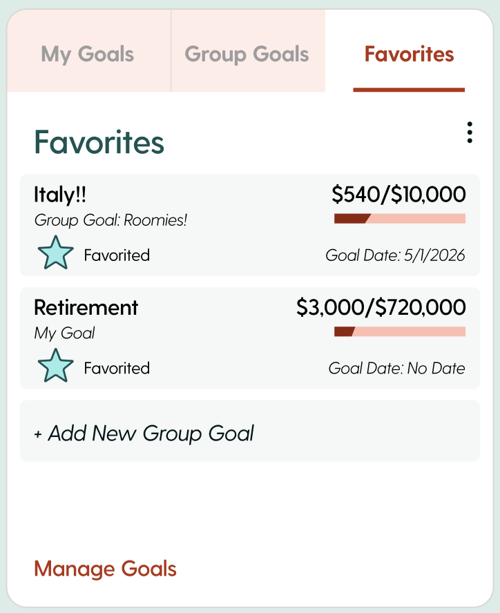
Users can now see how much their group members have added to a group goal. This allows group members to check other roommates progress, as well as their own, and ensure not one person is adding to the fund alone.
Before
After
Iteration 8: Undo Transaction
There is now the option to undo a transaction to eliminate user error after adding funds to a goal.
Before
After
High Fidelity Wireframes- Final Iteration
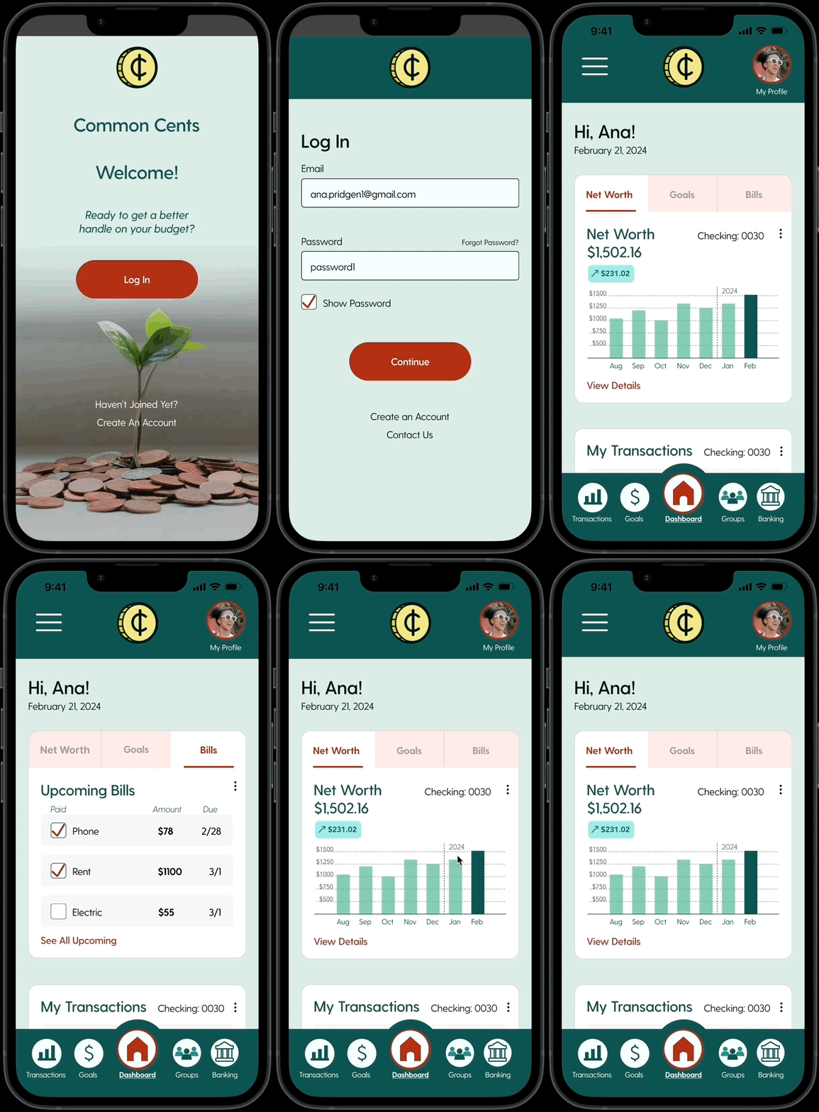
The final iterations of the high fidelity wireframes were created with the usability tests and iterations in mind. With the changes, the wireframes came together well for a complete, final look. Click arrows to scroll through pages.
Final Iteration Gifs
Final Iteration Layout
Conclusion
There were challenges with creating an end-to-end application with budgeting. Figuring out what kind of budgeting to do and where pain points truly lie was difficult, especially with income and pay being a sensitive topic to some. Deciding the UI layout was also a challenge. Trying to make a serious topic appealing to a younger audience constantly surrounded by other distractions on their phone made for constant research and comparisons between apps, budgeting and not budgeting.
I feel the app came together well. The logo, name, and icons work as one, and the color palette shows a modern take on the greens typically associated with money.


