Smooth Moves
Mobile Website Design
A website dedicated to helping people who are inexperienced at moving relocate from one home to another.
Role: UX/UI Designer
Tools Used: Figma, FigJam, Google Sheets
Timeframe: 4 months
What is Smooth Moves?
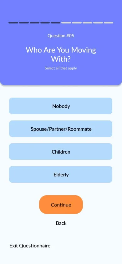
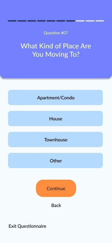
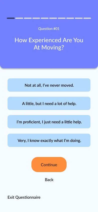
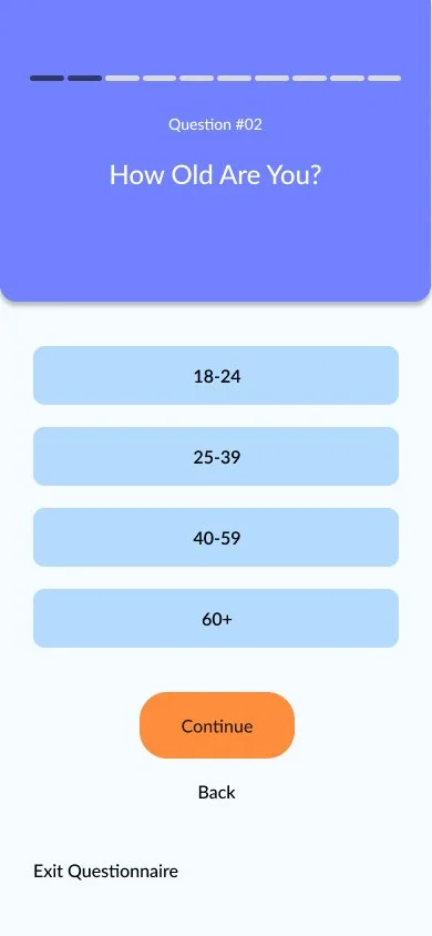
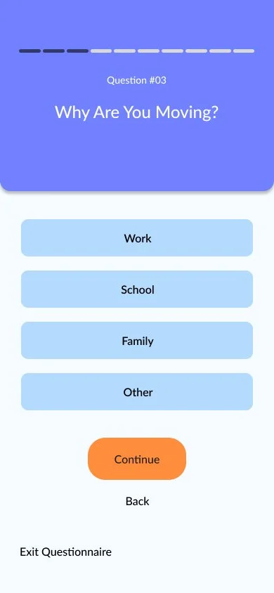
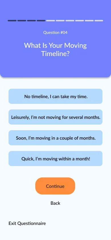
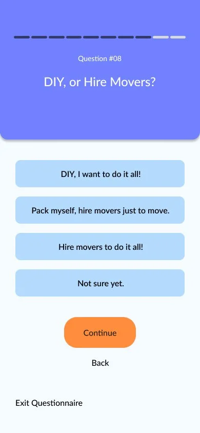
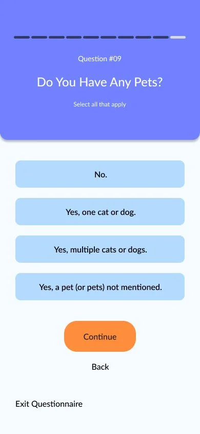
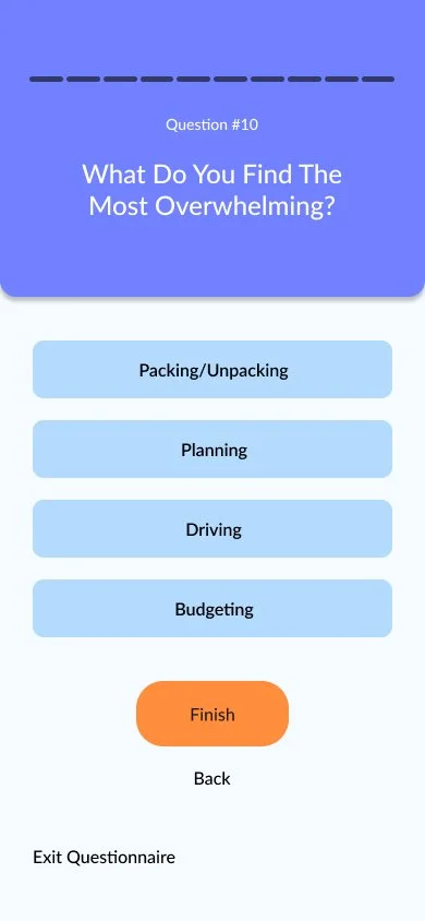
Smooth Moves is a website dedicated to helping people move for the first time, or people who have not moved in a long time get back into it. Moving can be very stressful, especially when a client is not quite sure what to do. Searching for help can be very overwhelming, too. Smooth Moves has all the information together in one spot, so users don’t have to worry about multiple tabs or too much information. Smooth Moves also offers the users a questionnaire, helping users find what they need on the website based off the needs presented.
Research Goals
We want to know what resources new movers need so that we can make them easy to understand and all in one place. We want to determine what is motivating the user to move, what resources moving requires, and the process of prioritizing specific information and resources.
My Role
For Smooth Moves, I was the sole designer. I created the timeline, name, branding, logo, and interactions for the website.
Timeline
Research
Competitor Analysis
Questions: What draws users to these websites, and why do users still feel confused and overwhelmed after navigating these websites?
Conclusion: Many moving websites, though rich in information, are not very easy to navigate or read, while companies that specialize in the process of moving specifically are untrustworthy.
User Interviews and Card Sorting
6 participants interviewed.
5 participated in Card Sorting topics into “Must Have”, “Nice to Have”, and “Not Needed” as 3 topics.
Ages: 25-63.
Key Findings
People are easily stressed out because of the moving process.
People tend to be surprised by the amount moving costs and don’t know how to budget properly.
People typically move for the first time because something is making them such as work; they don’t get to move for their own reasonings until later in life.
Organization is overlooked, but greatly needed.
Motivations for Moving
Work opportunity.
“Yeah, I got a job up here. I wasn’t actively looking for a job up here but being in a pandemic it was really hard to find anything.” -Nick, 25, moved from St. Louis, MO to Madison, WI
Finally affording a house you’ve always wanted.
“I had been looking for a bigger home because I wanted to be a dog lady with a big yard and fence.” - Marybeth, 47, moved from Germantown, TN to Collierville, TN
Expanding family, no matter what that means.
“I wanted a bigger house, so we moved from another area in Collierville.” - Nichole, 53, moved within Collierville, TN
Research Synthesis
Personas
Personas are created based off user research to understand the headspace of different types of users, and make sure the website goals help their problems and needs.
Mike, the young anxious businessman
Rachel, the busy working mother
POV Statements
Statements that are formulated with the intent of discovering the user’s pain points from their perspective.
I’d like to explore ways to help people moving for the first time reduce confusion in how to organize their things, because moving for the first time can be confusing without assistance.
I’d like to explore ways to help people moving for the first time reduce stress finding resources for how to move, because adding unnecessary stress to the first step of the process can make the entire moving process harder.
How Might We Statements
Statements that are formulated with the intent of discovering potential ways to solve pain points found in the previous POV statements.
How might we help people moving for the first time have correct information from an online source for the packing and moving process?
How might we help people moving for the first time access trustworthy resources in one place online that would help them in different stages of moving?
How might we help people moving for the first time move efficiently using a website while on a moving deadline?
Branding and Planning
Sitemap
Some key features added to Sitemap include:
Questionnaire to guide a user to information they may need.
Working tools, such as a place to keep notes or calendar to keep the move on track.
Resource tools, such as renters guides and insurance information.
Finding a moving company to help.
DIY (Do It Yourself) Options to find self moving companies.
User Flows
User flows show a step-by-step process of how a user would go through a flow on a website, and includes all paths possible.
Sign Up
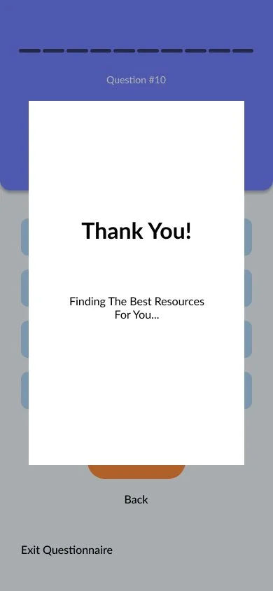
Sign Up flow was selected to show users the process of logging into the website, viewing the homepage, and taking the 10 page questionnaire.
Find A Moving Company
Find Movers flow was selected to give users the options to find potential movers within a budget, open moving information cards, and go to contact the company.
Task Flows
Task flows show a more direct step-by-step process of how a user would go through a flow on a website, only showing the happy path.
Sign Up
Find A Moving Company
Logo
Here you can see the logo creating process. The company calls for a logo that is not only trustworthy, but easy to see and understand.
Drafts and Sketches
My final two choices came down to either a house (Option A) or a truck (Option B), both symbolizing moving, trust, and sturdiness.
Option A
Option B
Final Logos
The final decision was a house. The house shows security and trust. The arrow symbolizes growth and moving forward, while looking similar to moving boxes.
Branding
For this mood board, I wanted to capture the idea of a trustworthy, informational website. I was drawn towards easy to understand UI, light colors, and the feeling of progression.
Mood board
After creating the mood board, I’ve decided a lighter palette with blue tones would be the best option for this app. An orange accent would help not only with contrast, but allow the correlation between moving supplies (boxes, trucks) and the app.
Style Tile
Design and Testing
Low Fidelity Wireframes
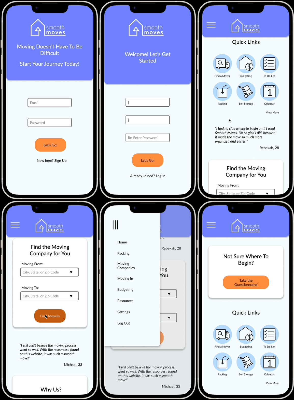
These wireframes were created with the intention of deciding the basic overall look of the website. The home screen and moving screens were formed as the two most important screens as decided from the flows.
Mid Fidelity Wireframes
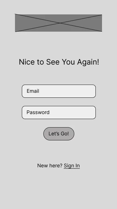
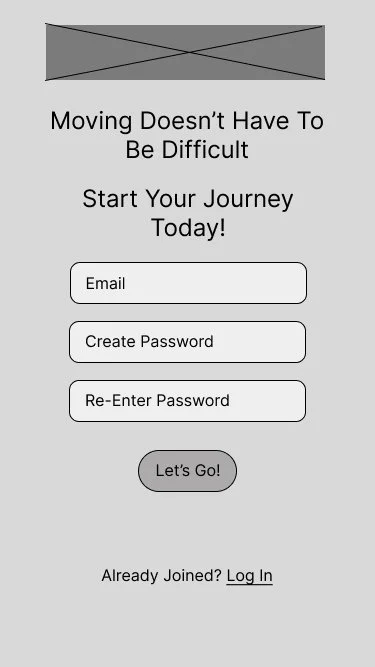
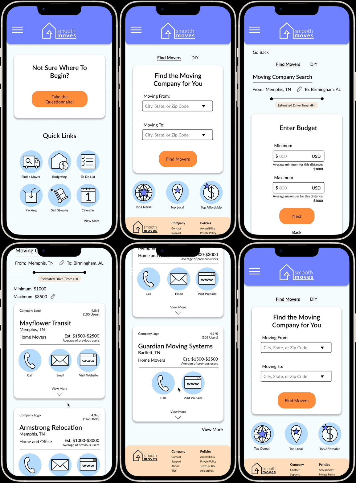
More specific pages were formed when creating the mid fidelity wireframes, including log in screens, finding a mover, and entering a budget.
High Fidelity Wireframes- First Iteration
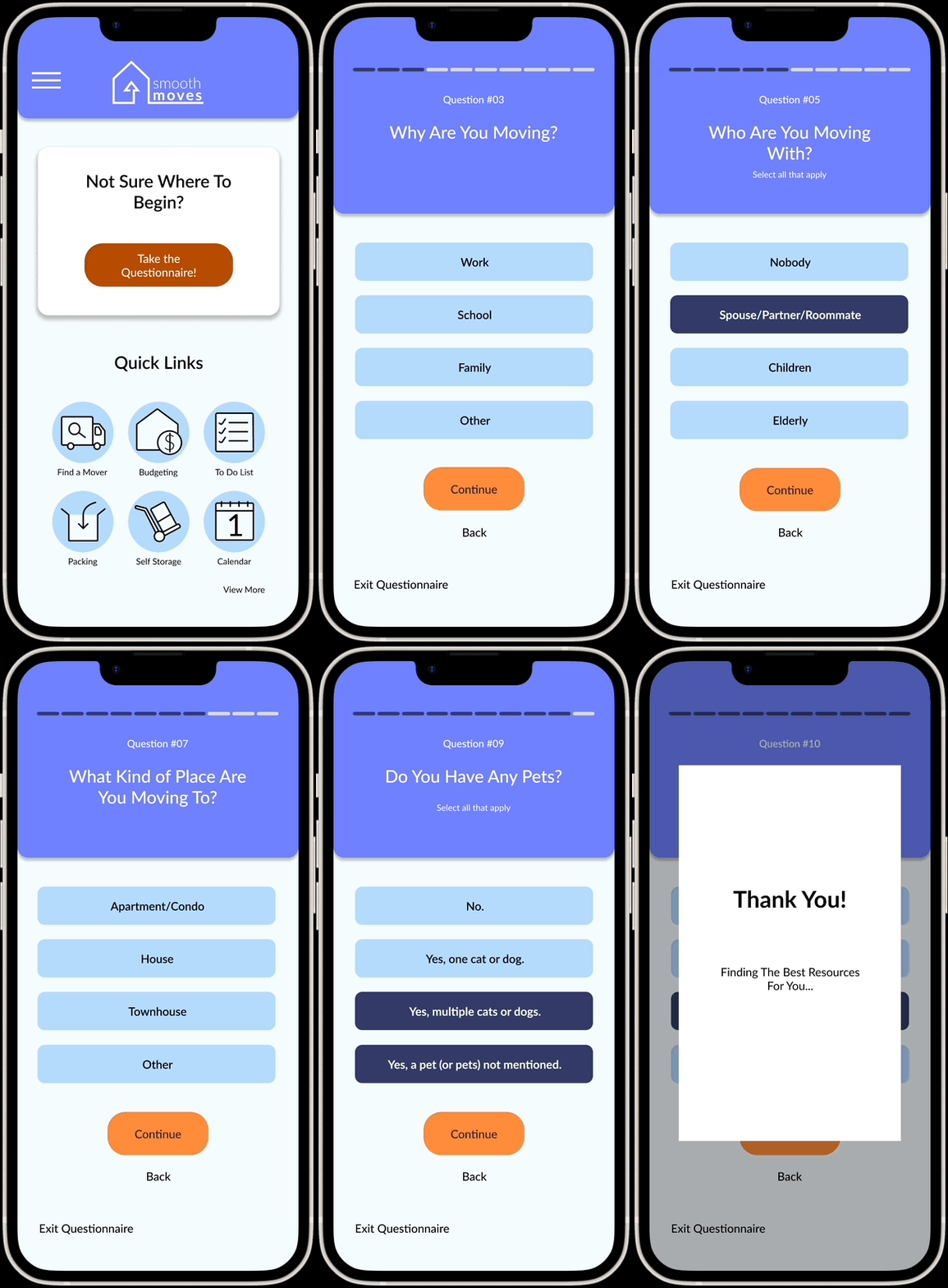
The first iteration of these high fidelity wireframes take into account everything discovered through research and branding. These screens are to be tested with users. The questionnaire was created with the high fidelity wireframes, as it felt appropriate to include with the usability tests.
User Testing and Research
5 participants asked to go through flows following a scenario.
4 conducted through Zoom, 1 conducted in person.
User Testing Conclusion
Flows deemed successful.
Participants completed the two flows quickly and with ease.
Participants did not have trouble figuring out next steps in flow.
High Fidelity Wireframes- Iterations
Iteration 1:
All screens resized for iPhone 14.
Before
After
Iteration 2:
Sign In and Log In interactions changed to be more user friendly.
Rather than only clicking “Sign Up” or “Log In”, users can now click the entire prompt to move to the new page.
Before
After
Iteration 3:
Quick Links are now stacked in two rows of three instead of scrolling off the screen to avoid the user accidentally swiping back a page on a web browser.
Before
After
Iteration 4:
The gap for drop down menus has been eliminated, and the website now expands and contracts with the drop down menus presented.
Before
After
Iteration 5:
Budget card now has suggested information for the user to feel more comfortable entering in their prices.
Before
After
Iteration 6:
Moving Company- Company Cards page now has budget information at the top of the screen for user to see.
Before
After
Iteration 7:
Moving Company Cards now expand and show more information to the user.
Before
After
High Fidelity Wireframes- Final Iteration Gifs
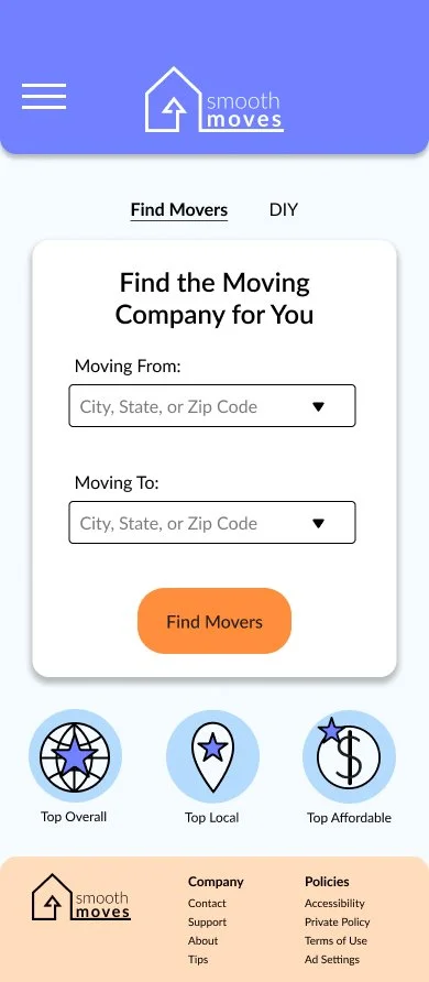
These pages, with iterations included, resulted in a much more concise and complete look to the wireframes. Making the spaces smaller while giving the user more information allows the website to function in a more professional light.
High Fidelity Wireframes- Final Iteration Layout
Conclusion
With the time given, the website has enough information to achieve the research goal. Smooth Moves would benefit with more time, pages, and user testing in the future. Having a more vast user group would also benefit this website, giving more information to the kind of moving people go through. Testing with more users on an actual iPhone, rather than on Zoom with a desktop layout, would also greatly benefit the website and add more input for sizing and interactions.
I feel the final product was successful. I’ve learned a lot from this study, including how to make interactions for an iPhone translate well onto a desktop for distance testing.


