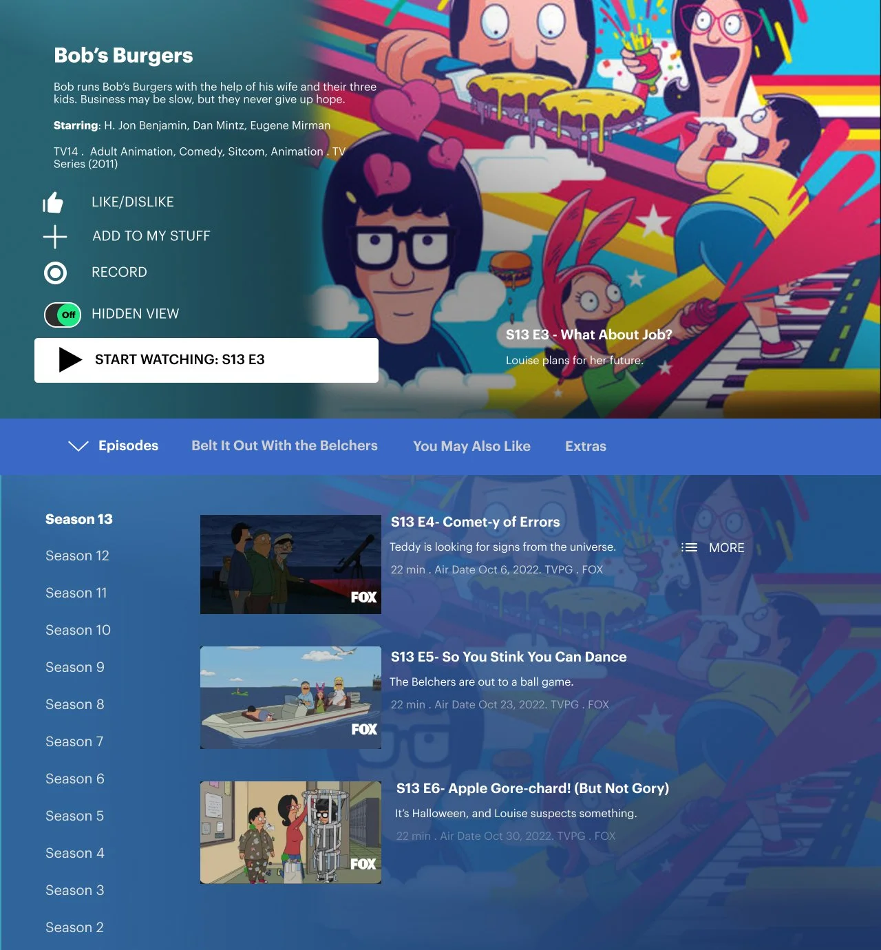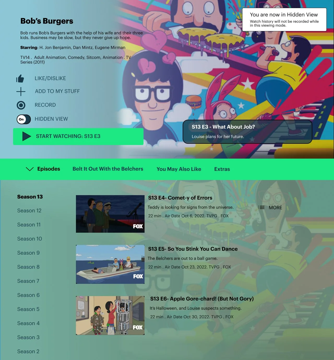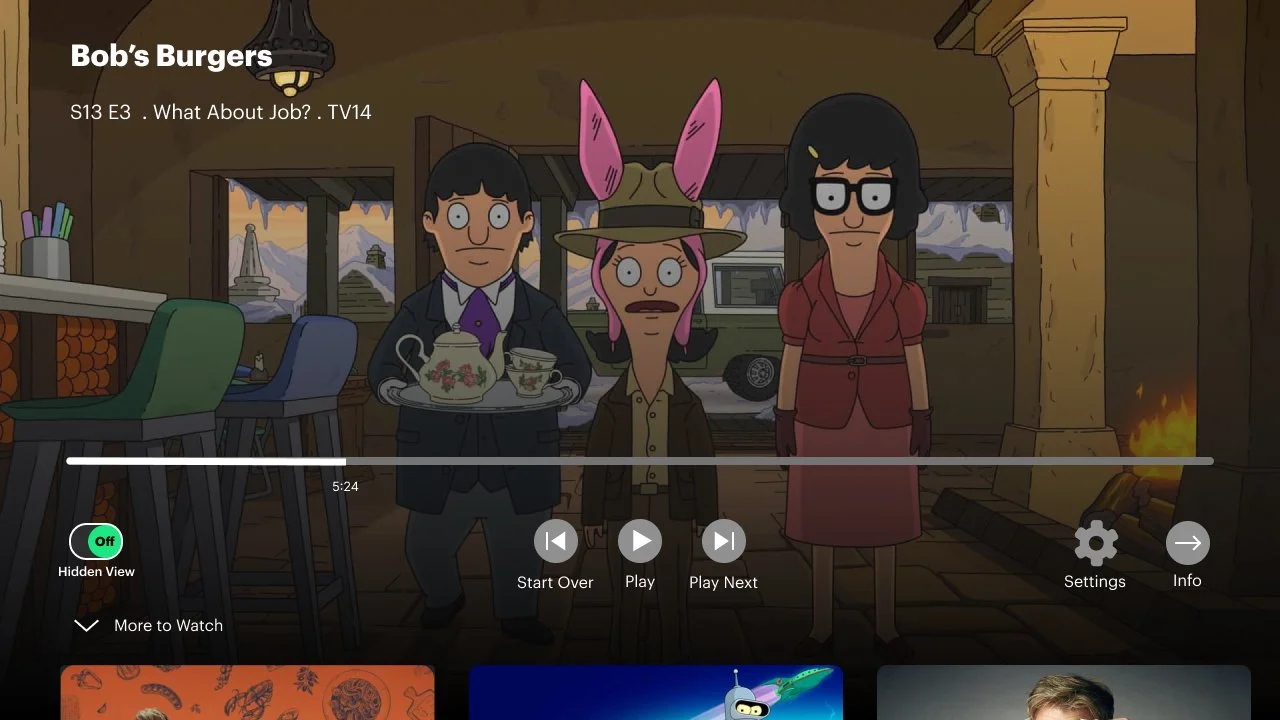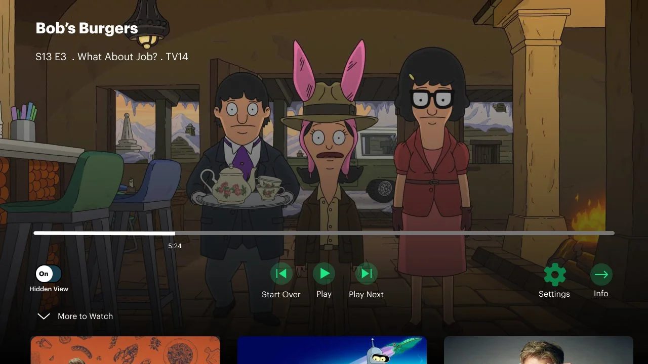
Hulu Hidden View
Add a Feature
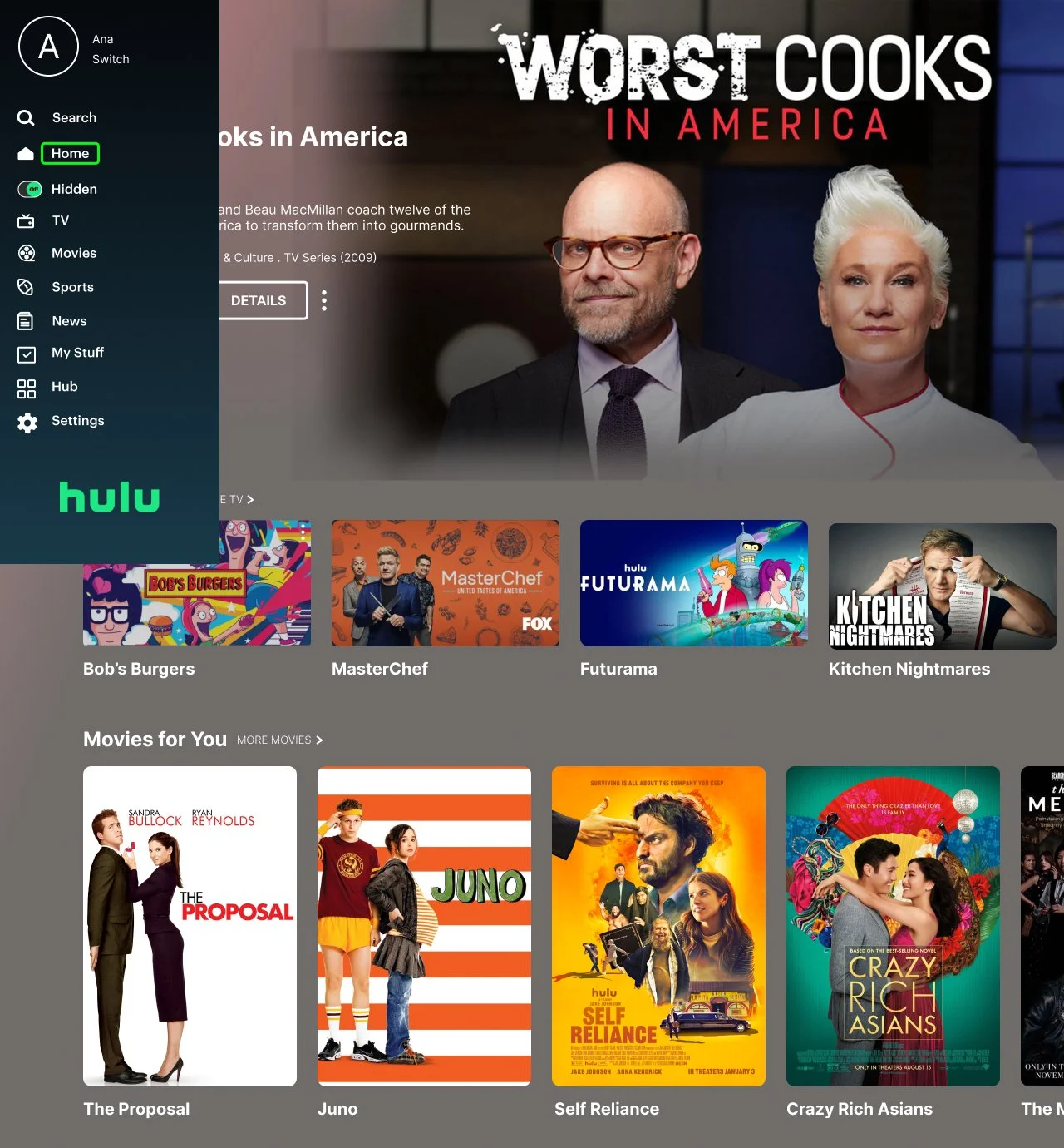
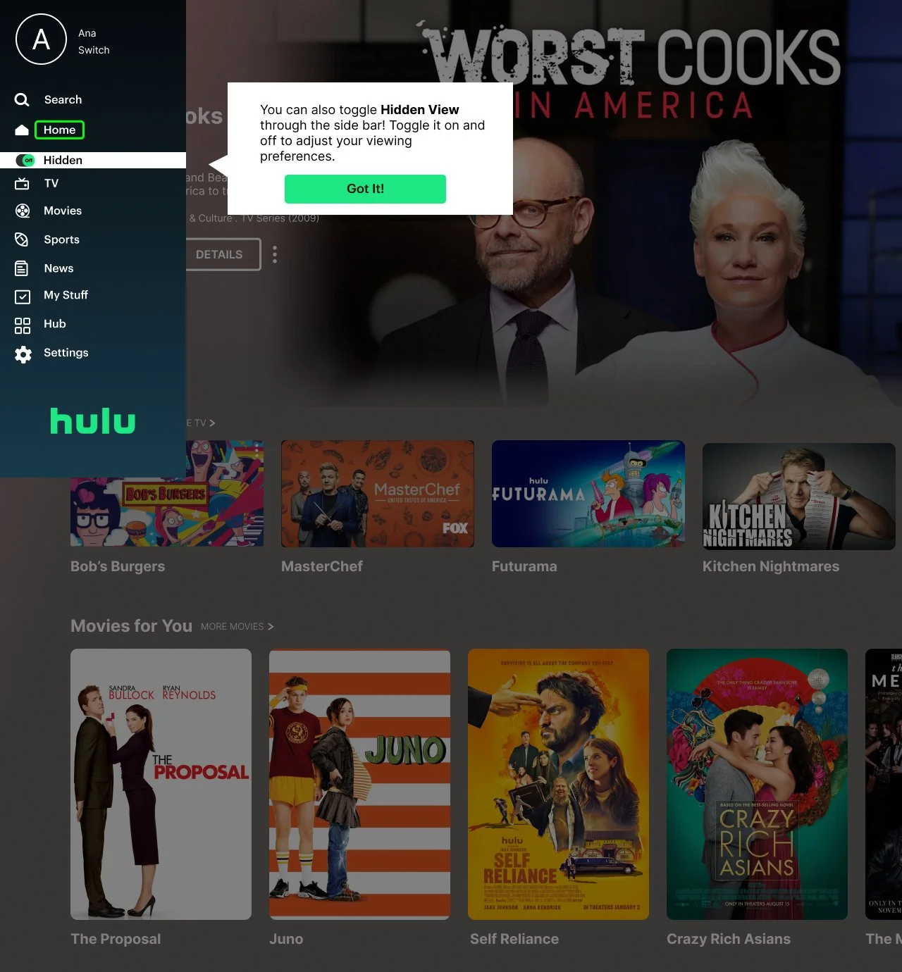
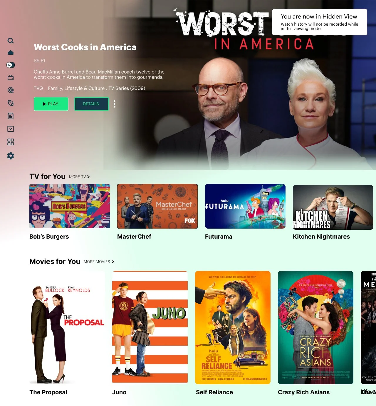
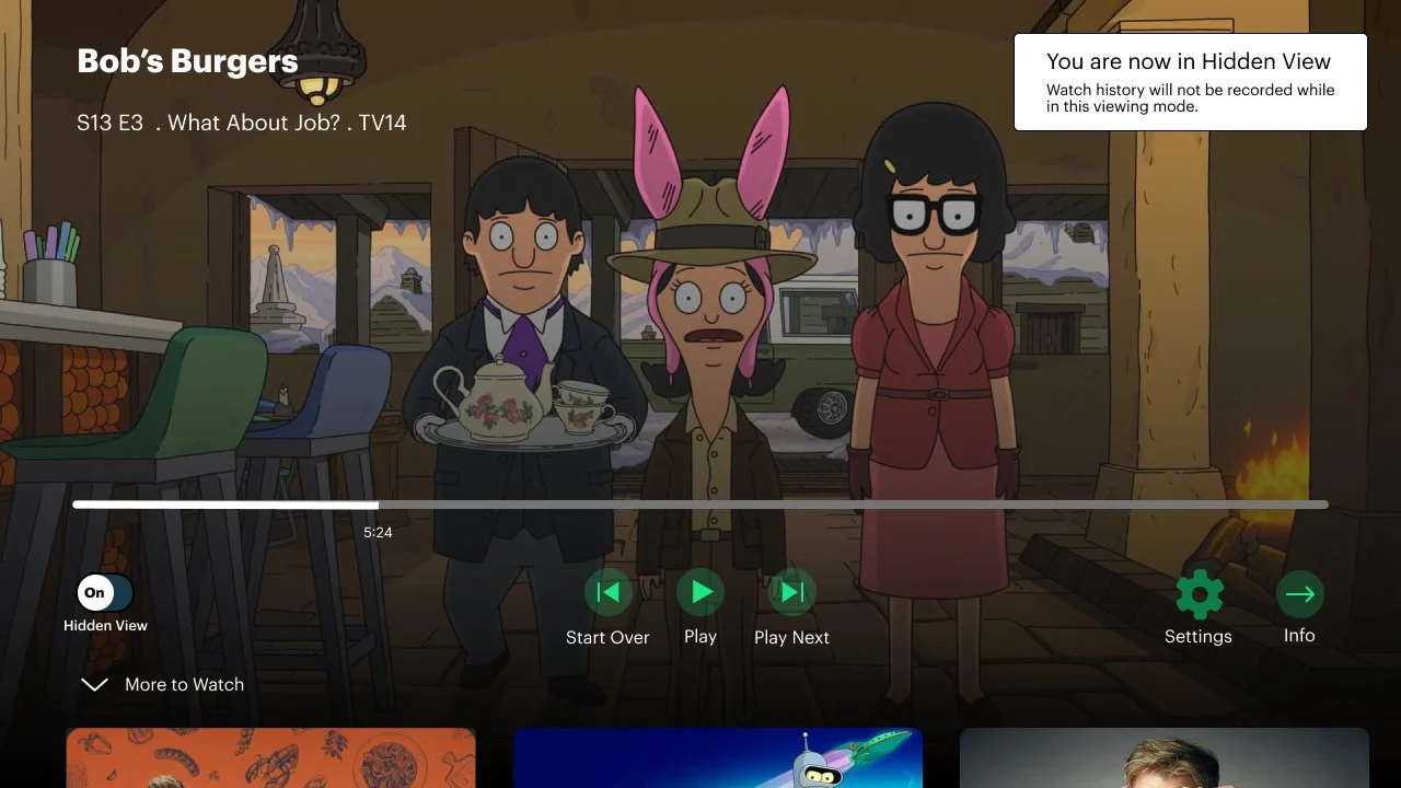
A feature that allows the user to watch TV shows and movies without it affecting their watch history, current place in their TV show progress, and suggested TV shows and movies.
Role: UX/UI Designer for Hidden View feature
Tools Used: Figma, FigJam, Hulu, Hulu Branding Guide, Google Drive
Timeframe: 4 weeks

What is Hulu?
Hulu is a streaming platform created in 2007. It rose to popularity in the 2010s, and has only risen since. Hulu streams tv shows and movies, as well as offering live TV depending on your package. They also have their own original shows, just like their competitor Netflix. The cheapest version of Hulu includes ads, but you can opt for a package without ads. They are a monthly subscription, similar to Netflix. They also offer packages with other streaming sites, including Disney+. They have never been as popular as Netflix, but unique UI and features may help that.
Project Goals
Hulu, though vast in it’s features, lacks the option to watch something without it staying on their watch history. Creating a feature to allow for viewers to watch a show or movie without it affecting their history or suggestions was a task I felt was important to tackle. I want to make this feature integrate well into Hulu’s current UI, while allowing a fun new interaction for subscribers. Subscribers also need to be able to see the feature and learn what it is, while not be overwhelmed or annoyed with information or changes.
Timeline
Research
The research stage was conducted in order to understand what feature could be useful for Hulu. It helped determine who they’re competing with with other streaming sites, what features they could be missing out on, and why certain subscribers do or do not like Hulu’s current layout. Partaking in competitor analysis, user interviews, and user research helped me gain insight into what Hulu is doing right, and what could be improved.
Competitor Analysis
The purpose of this analysis was to determine what makes other streaming websites and apps that are direct competitors to Hulu more popular in the eyes of some subscribers, especially their most intense competitor Netflix. Figuring out what brings users to these websites and apps will help figure out what feature would be best to add to the website.
Questions: What draws subscribers to these streaming services, and what do the services do to keep their subscribers?
Conclusion: Giving the subscriber multiple options, easy to use layouts, and a trusting tone allows subscribers to feel safe and comfortable with these platforms.

User Interviews and User Research
In order to gain information needed amongst subscribers, I decided to interview 5 different people. Their locations included New York, Florida, and California. They were aged 19 years old to 55 years old, and they had all used Hulu before at some point. Some had used Hulu with their own account, and some borrowed from somebody they knew. Interview results and findings found below.
Key Findings
All used Hulu on their TV as their main form of watching.
Most users had Hulu because they share it, rather than having their own profile.
People are unhappy with Hulu’s ads, but watch them anyways to keep the cheapest subscription option.
People enjoy Hulu’s specifically made playlists- Examples include “HuluWeen” and other holiday playlists consisting of tv shows or movies in the genre.
Some users watch Hulu to specifically watch a show, while others ”watch” Hulu by having it playing while doing other tasks.
Research Synthesis
The research synthesis stage was conducted in order to collect all research findings into easily viewable results, which is why the creation of personas was so critical. These help quantify the results of preliminary research in ways that make it easier to move forward with branding and planning, while brainstorming potential features.
Personas
Two personas created to demonstrate the different pain points users can have due to their situation, age, and social dynamic. Carrie, the 58 year old mother, loves to share her Hulu account with her children. However, they don’t often change the profile to their own when watching things, and mess up Carrie’s watch history, place in her shows, and suggested TV shows. Eddie, the 24 year old sports fan, loves using his family’s Hulu Live TV to watch sports with his friends. After the game, he likes to watch his favorite parts of shows with his friends without watching the entire show, but it messes up his watch history.
Carrie, the 58 year old mother.
Eddie, the 24 year old sports fan.
Branding and Planning
Branding and planning is necessary for the feature to become a tangible thing for subscribers to use. Making sure a flow is established helps determine what pages to create in a wireframe and how the feature can be used. Using information gathered from research synthesis allows the creation of these flows, and allows the brainstorming of a more concrete feature. Creating (or recreating) icons here help understand Hulu’s brand guidelines, and help incorporate the feature into those guidelines.
User Flow
User flows show a step-by-step process of how a user would go through a flow on a website, and includes all paths possible.
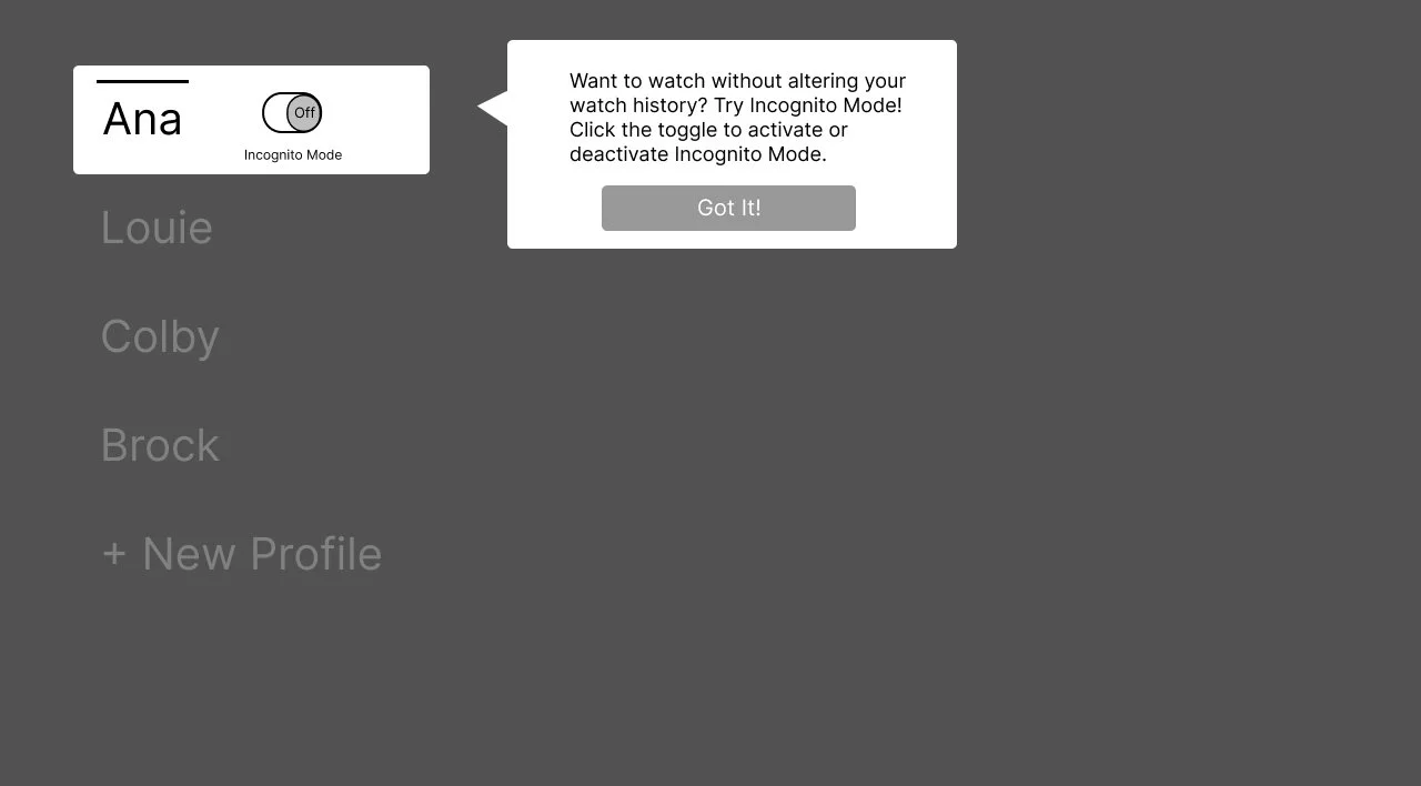
Sign into Ana’s profile, Select ”Bob’s Burgers”, enter Incognito Mode, Play Episode
This flow was selected to demonstrate to the user that there are multiple ways to achieve their goal, and to test which way they would go about the flow.
From the last page of the first flow, leave Incognito Mode
This flow was selected to see how the users would decide to leave Incognito mode and if they would go the longer flow or notice the shorter flow.
Branding
All branding is courtesy of the branding guide Hulu has released to the public. Attached below are the main icons, typography, logo rules, and color palette used in the wireframes and on the Hulu website and app.
Icon Creation
Icons were recreated by me on Figma. I took a picture of the Hulu icons on my television, put the photos in Figma, and recreated the icons as vector images with the photo as a side by side comparison.
Side icons, White
Side icons, Black
Other icons
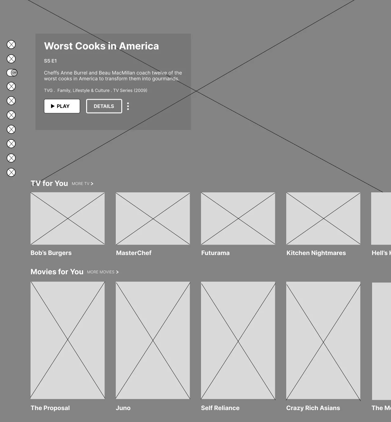
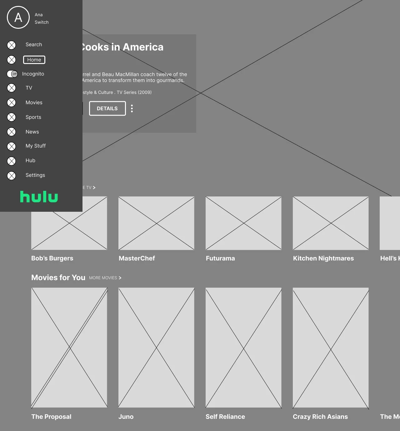
To create the Hidden View toggle, I took into account the style and interactions of the other icons Hulu has, and toggles other websites have for their versions of Hidden View (i.e. Incognito Mode for Google).
Design and Testing
The following designs are created to test the overall look of the feature, and how it fits in the current context of Hulu’s already established branding and UI.
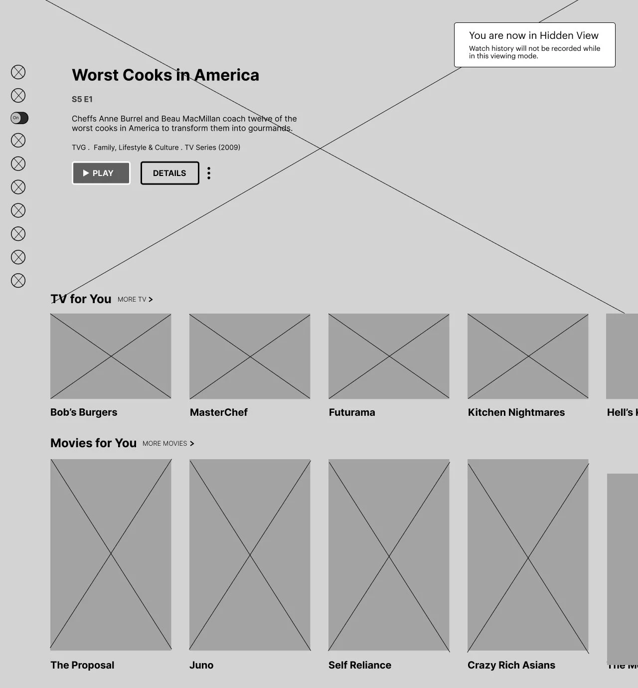
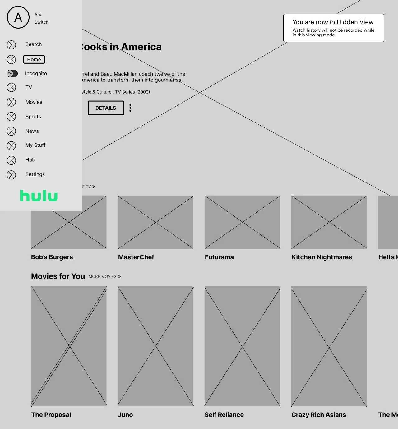
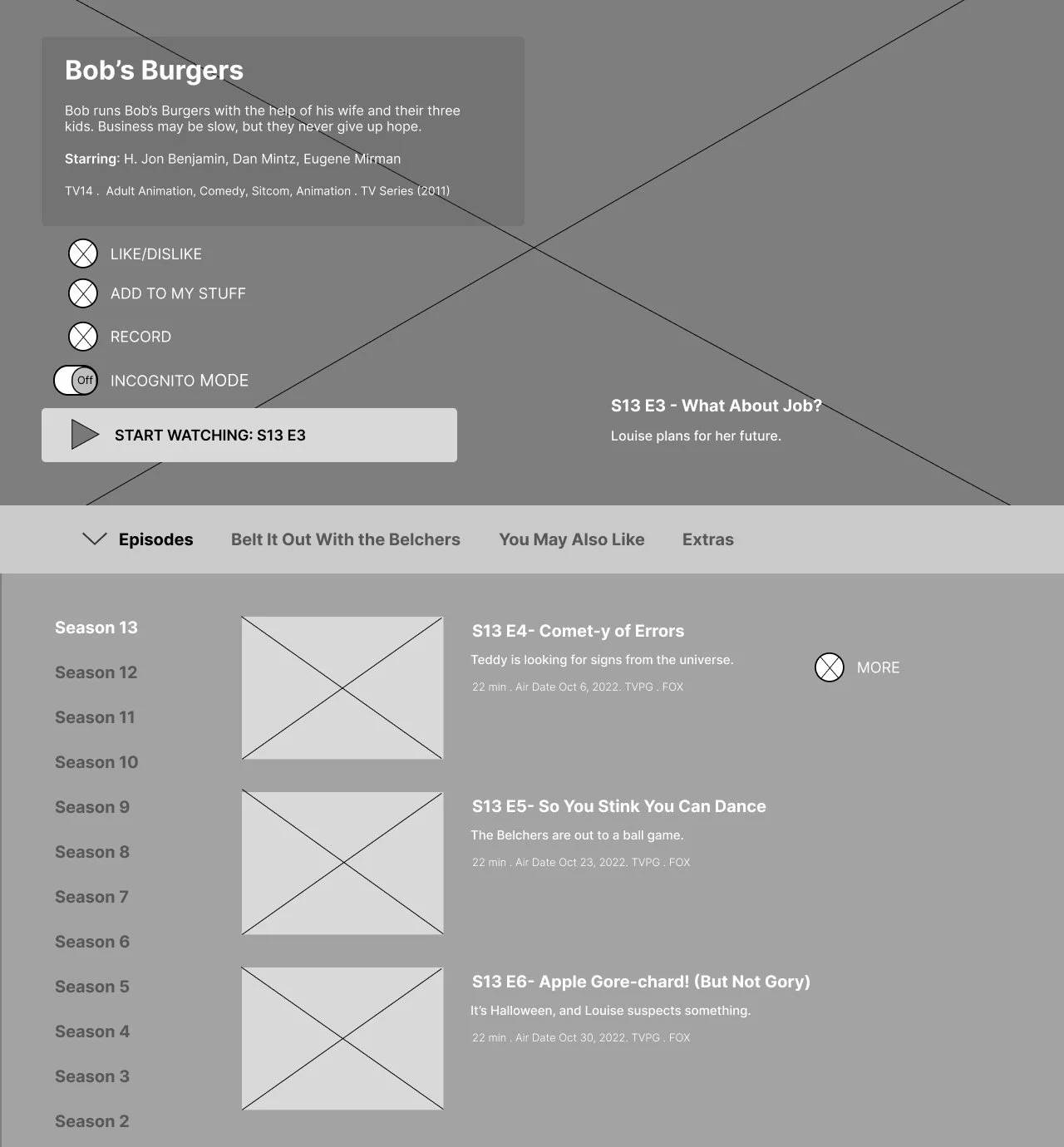
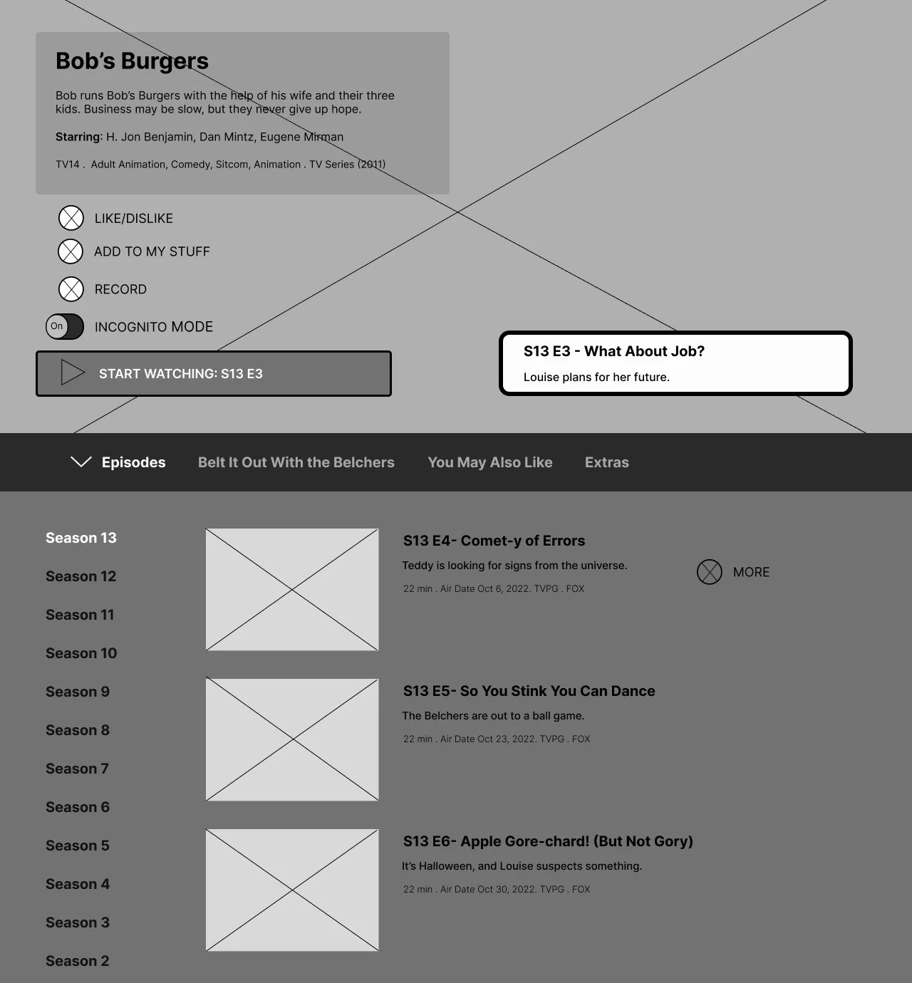
Mid Fidelity Wireframes
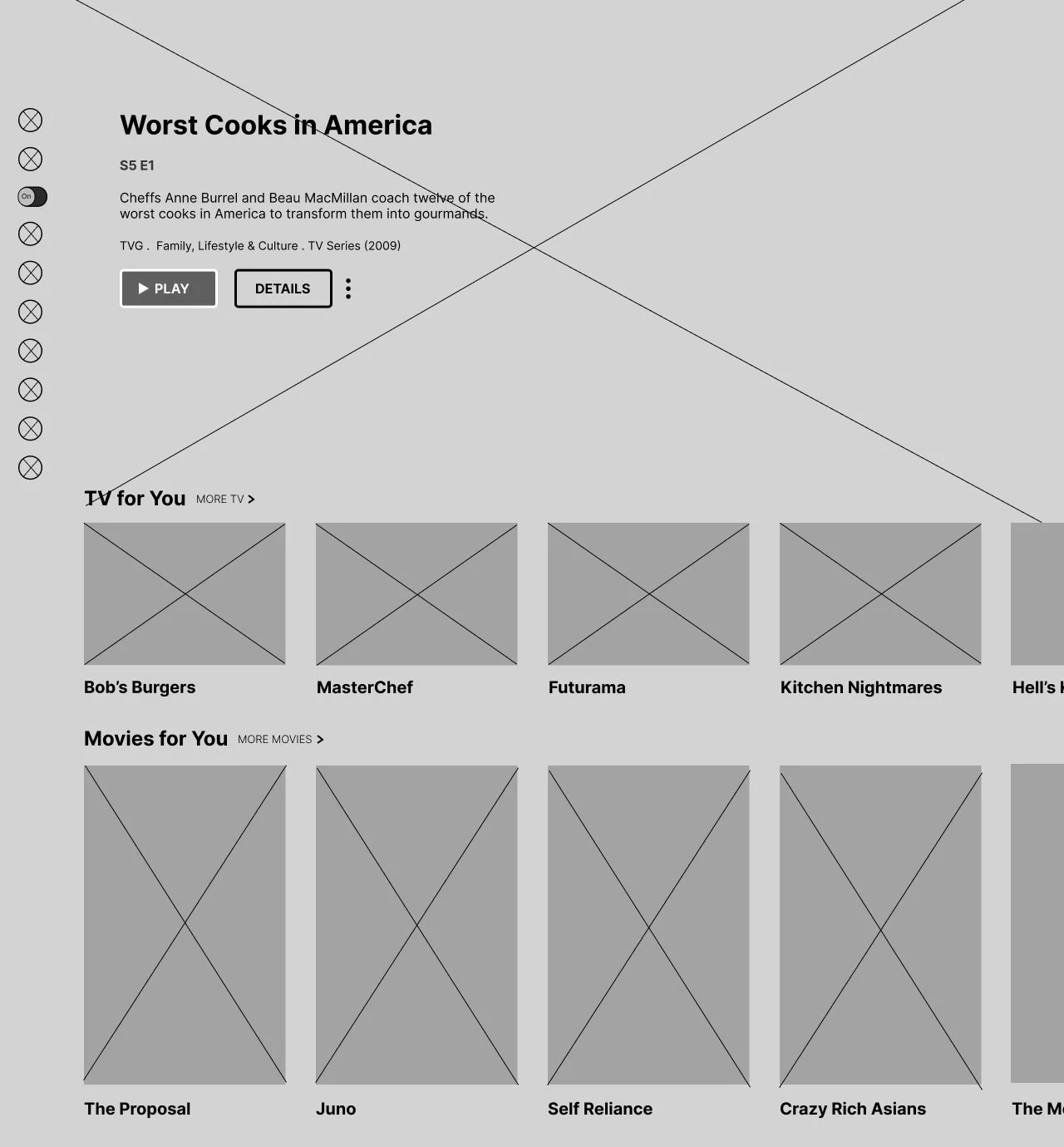
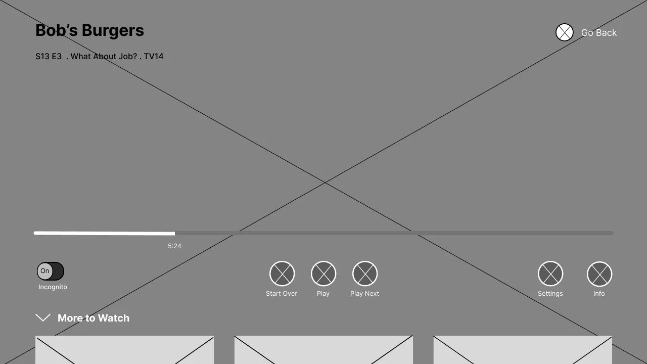
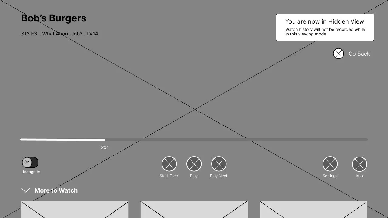
The purpose of these wireframes is to focus on the structure and functionality of the application and the added feature, without getting bogged down about specific design aspects including branding and color scheme.
Usability Testing
After creating the mid fidelity wireframes, I wanted to test the functionality of the feature and determine users’ opinion of the function. I tested five participants, age ranging from 25-55 years old. Four participants’ user flows were conducted via Zoom, and one was conducted in person. All users were given two flows to complete. After completion, the users were asked questions about the flows, their experience, and the feature itself. Results from the testing are below.
Key Findings
Users found the tasks to be simple and quick to complete.
Users thought the toggle was simple and easy to use.
Users completed both tasks very quickly.
2 Users selected Incognito Mode in the first, while the other 3 selected Incognito Mode when asked to in the flow.
Users liked the implied UI difference between Regular watch view and Incognito Mode.
Buttons were either too small or too big, did not fit idea of website.
Other changes were interaction and flow based.
Iterations were made during HiFi creations.
Iterations made between MidFi and HiFi Wireframes
After gathering results, it is clear iterations must be made.
The first iteration was to change the name of Incognito Mode to Hidden View. Incognito Mode is used for some internet website browsers, and therefore can have a double meaning. Users suggested changing the name of this to something else because of this double meaning. Hidden View was selected as the new name.
Hidden View’s pages currently reflect the user’s watch history. In the next wireframe, it will reflect a new profile in order to hide the user’s watch history and recommended shows.
The size of the toggles will be smaller. As of right now, users find the toggle large and inconsistent with the rest of Hulu’s established UI.
High Fidelity Wireframes (First Iteration)
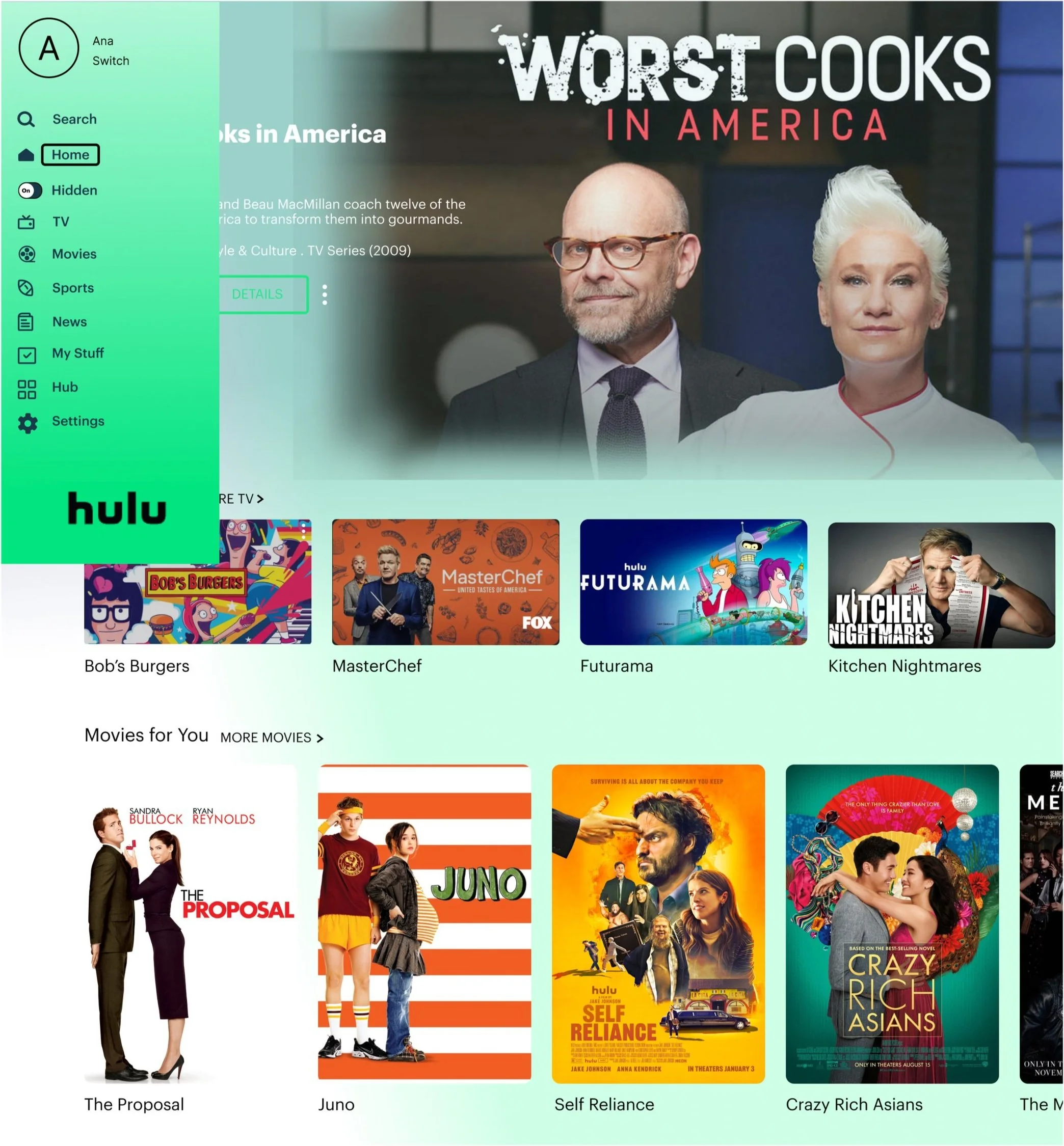
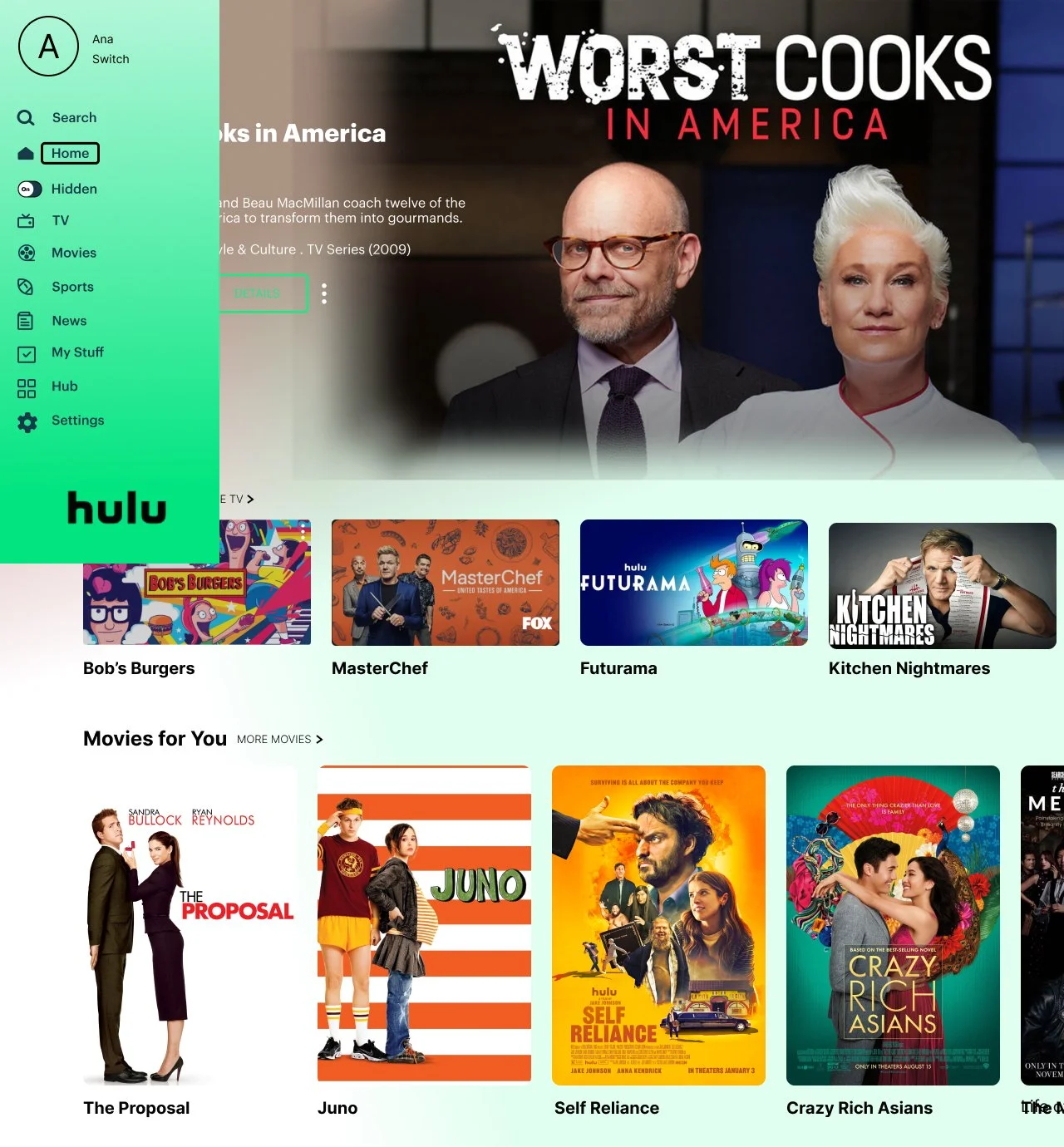
These wireframes were created to show how the branding and color palette of Hulu would fit in to what I have created in the mid fidelity wireframes, including the new feature. This allows me to figure out how the Hidden View color palette would look like in the greater context of Hulu, and experiment with the Hidden View toggle’s buttons as well.

Usability Testing for High Fidelity Wireframes
The usability tests for the high fidelity wireframes were similar to the mid fidelity wireframes test with the amount of participants needed. Five participants were tested, four of who also participated in the mid fidelity wireframes. Their ages ranged from 25 to 55 years old. They were given the same scenario from the earlier task flow. When completed, users were asked questions regarding the UI and flows themselves. Findings and results can be found below.
Key Findings
Users found the tasks to be simple and quick to complete.
Users responded positive to the Hidden View color palette.
Users liked the name “Hidden View” over ”Incognito Mode”.
Some users felt the amount of information boxes was too much.
Iterations
Iteration 1: Hidden View Explanation Box
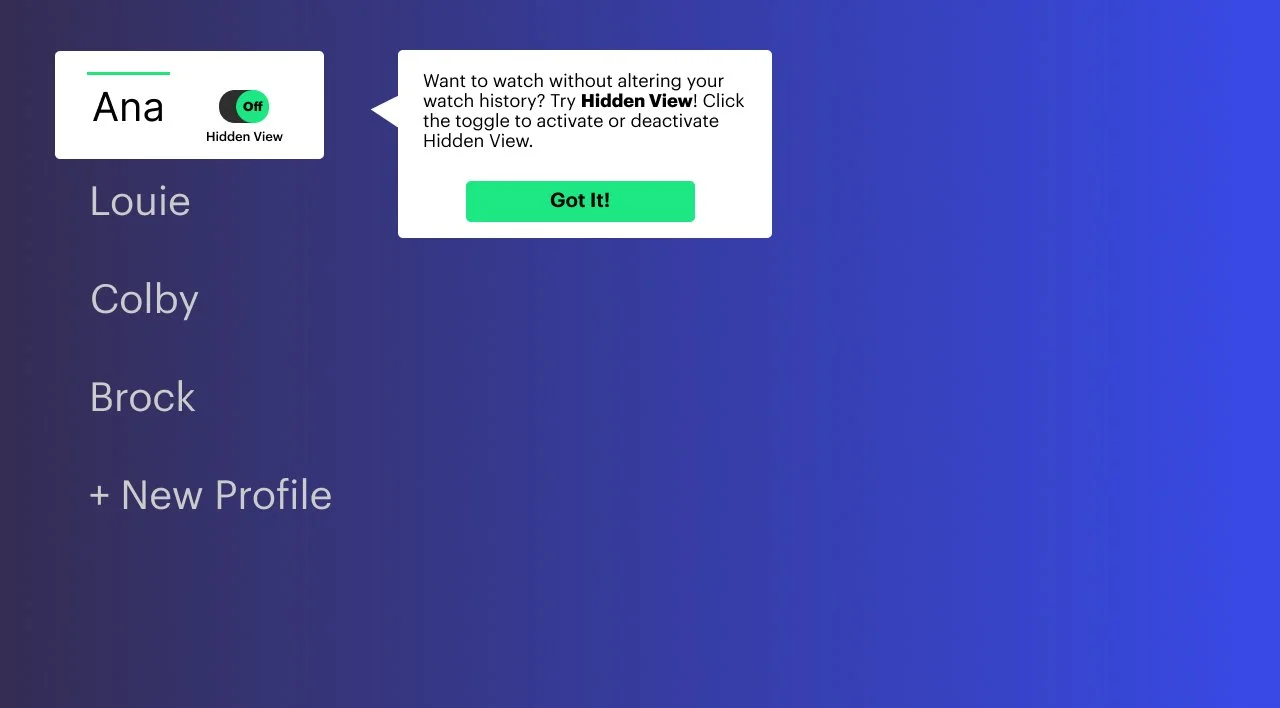
The Hidden View pop up box has been removed from the Bob’s Burgers details page. The original pop up box was deemed redundant and annoying, as users seemed to be upset when it appeared again. Allowing the user to gain context with the previous 2 pop up boxes will lead to trust between the user and the feature.
Before
After
Iteration 2: Episode Details Background
The Hidden View Bob’s Burgers page’s detail box is lightened, allowing for a less intense look. The original dark description box did not fit the rest of the established UI of the Hidden View feature, nor the regular UI of Hulu. Making the square’s outline be thinner while the box is see through makes the description box blend in more semelessly.
Before
After
Iteration 3: Smaller UI Changes
The icons on the watch page in Hidden View have been lightened, fitting in with the regular watch view. The regular watch view’s icons are a light grey and fit in well with the screen, not distracting the user with bright colors. The faded icon colors allow the user to know what they are looking at, while making sure it is not distracting and takes them out of the moment.
Before
After
High Fidelity Wireframes (Final Iteration Gif)
High Fidelity Wireframes (Final Iteration)
Conclusion
Adding a feature to a known site was a challenge. Matching the UX/UI, though difficult, was very informative as to how major companies create their flows and interactions, and why they go about things such as their brand, logo, and icons.
More time would allow me to capture more specifics of the UX/UI of Hulu, including small graphics that could not be replicated, like animations.
I feel I captured Hulu accurately, and I could imagine seeing Hidden View as a valid feature on their app/website.


