Lizzy’s Edibles
Responsive Website
A responsive website for a local business dedicated to honesty with ingredients for their hemp-based THC/Delta 9 infused edibles.
Role: UX/UI Designer, Branding Coordinator
Tools Used: Figma, FigJam, Zoom, Gmail, Google Drive
Timeframe: 4 weeks
What is Lizzy’s Edibles?
Lizzy’s Edibles is a company based in Madison, Wisconsin that focuses on selling Delta 9 edibles in an honest and visible way. Delta 9 is a hemp-based TCH product. Lizzy’s main creators, Nick Schmidt and Andrew Webb, create the product themselves. Webb has a degree in Chemistry, and distills and formulates the product, while Schmidt focuses on branding, marketing, and overall production.
Project Goals
Lizzy’s currently does not have a website or storefront, and is only sold word-of-mouth. The goal of this website is to increase traffic and users, as well as get their name known. The product itself needs to be transparent, honest, and real with its clientele.
Timeline
Research
This research stage was conducted in order to understand what is needed in a website for the specific clientele Lizzy’s wants and needs for their product. Using competitor analysis, user interviews, and user research allows for the creation of specific features and necessary additions to the website that must be made from scratch.
Competitor Analysis
Questions: What draws users to these brands, and what do the brands do to maintain their clientele?
Conclusion: Many websites are easy to navigate, informational, and eye-catching. Making sure Lizzy’s website has these in mind, as well as making it more transparent and usable, will allow them to get and maintain the users they want.
User Interviews and Research
For this stage, I felt it necessary to interview five people of different familiarities with CBD, THC, and other similar products. Four interviews were conducted via Zoom, and one was conducted in person. The ages ranged from 25-63 years old. The questions presented were based on usage of CBD and THC, online shopping habits, and brand loyalty. Results can be found below.
Key Findings
No interviewees initially knew the difference between Delta 8 and Delta 9.
No interviewees used CBD .
All interviewees take around 5-10mg as a dosage.
One interviewee takes roughly 5 mg, the other four take 10mg
Uses for THC:
Recreationally (5)
Sleeping Aid (2)
Two interviewees specifically mentioned liking a good home page/landing page with succinct product information that is easily accessible.
Zayne, 26, California: “I think an easy to follow homepage is the most important. Like, if itʼs a specialty shop that only has a few things, feature all of them on the home page and donʼt make it hard to find things. If itʼs a massive seller like Amazon, make it easy to find the departments and what youʼre looking for. I think the home page is the most important thing, especially it being the first thing you see. So featuring products on there that show a good scope of what the company is.”
Levi, 29, Wisconsin: “For me, a nice main page thatʼs clear about what the product is is what I think is probably the most important thing.”
All 5 interviewees specifically mentioned search and filtering as either something they like, or something missing from a website they dislike:
Levi, 29, Wisconsin: “I love a good hamburger menu on the side that has very clear bullet points for what I'm looking at and isnʼt vague by any means and has drop downs in those bullet points that lead me to other products and desires that I need.”
Abby, 59, Tennessee: “I do a lot of Amazon shopping for everything, even basic needs. I like to use the filters and the search”
Laura, 63, Tennessee: “I love the return policy, and their search, itʼs so easy to use and navigate. I love the filter you can select the size and color and brand. I just like them.”
Meagan, 25, New York: “The thing about online shopping that I appreciate the most is just the drop down bars that have categories. Being able to go to the direct category Iʼm looking for is nice... I just go straight to what Iʼm looking for, and filter out what I donʼt really care for. I like the details and filters where you can see, you know, popular brands they have, or the types and subcategories within that category. I feel like thatʼs helpful.”
Zayne, 26, California (Dissatisfied with a website) : “Terrible. Terrible layout. You canʼt search!”
Research Synthesis
This stage was conducted in order to organize information gathered from the research stage. Laying out the information in different ways, including Personas and POV/HMW’s, allow it to be easier to understand and show what must be added to the website in order to follow what both Lizzy’s want and what potential clientele want.
Personas
Two personas created to demonstrate the different clients Lizzy’s has gotten and can get in the future, as well as demonstrate different pain points people can have based on age, activity, and social dynamics.
Sarah, the 47 year old runner.
James, the 25 year old socialite.
POV Statements
Statements that are formulated with the intent of discovering the user’s pain points from their perspective.
Iʼd like to explore ways to help new users of Delta 9 products be able to trust the product and company more, because new information can be difficult to understand.
Iʼd like to explore ways to engage users of Delta 9 products in the ingredients and lab results, because knowing that information can help them understand why they like to buy one product versus another.
How Might We Statements
Statements that are formulated with the intent of discovering potential ways to solve pain points found in the previous POV statements.
How might we increase trust in a website so new users of Delta 9 feel comfortable purchasing a product?
How might we make technical information more engaging to read to a user who typically skips over that information?
Branding and Planning
Branding and planning was created to begin planning how to lay the website out, including what features to add, the color palette, icons, and even font.
Sitemap
Some key features added to the Lizzy’s sitemap include:
Lab Results page, to tell users what is in the Lizzy’s products and how it was tested.
Favorites Icon, to let the user remember things they want to buy in the future.
Product pages with information about the product, ingredients, and testing information.
Suggested products to let users know what they could have as well.
User Flow
User flows show a step-by-step process of how a user would go through a flow on a website, and includes all paths possible.
Buy 1 pack of Watermelon Edibles, create an account, use one time payment.
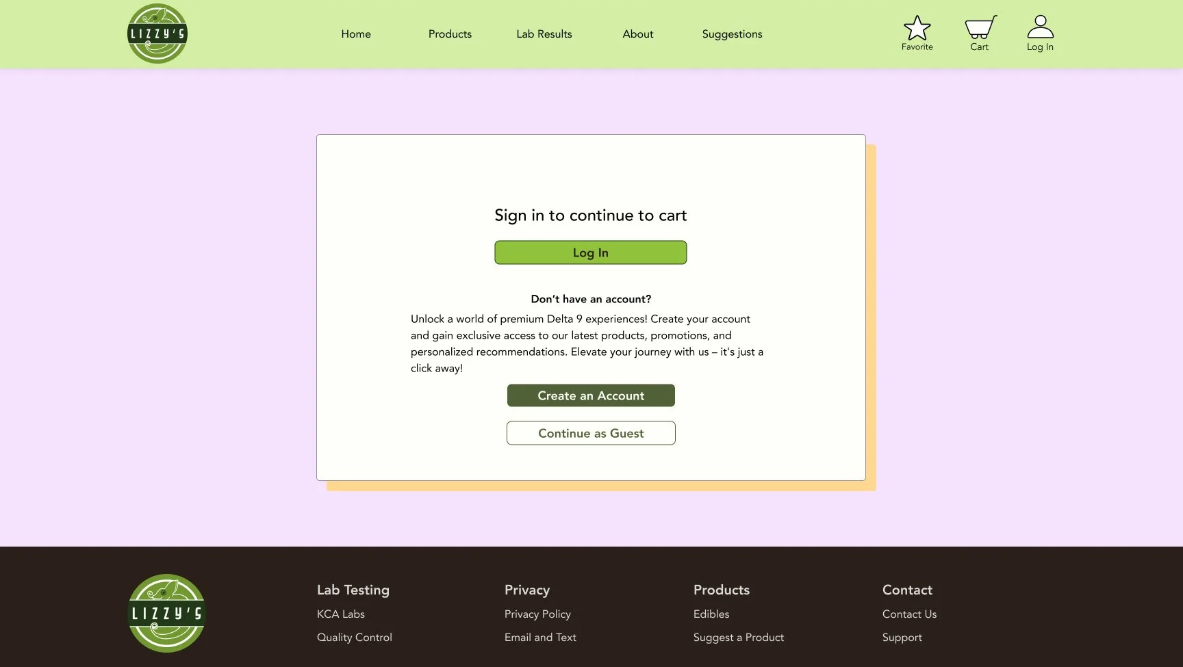
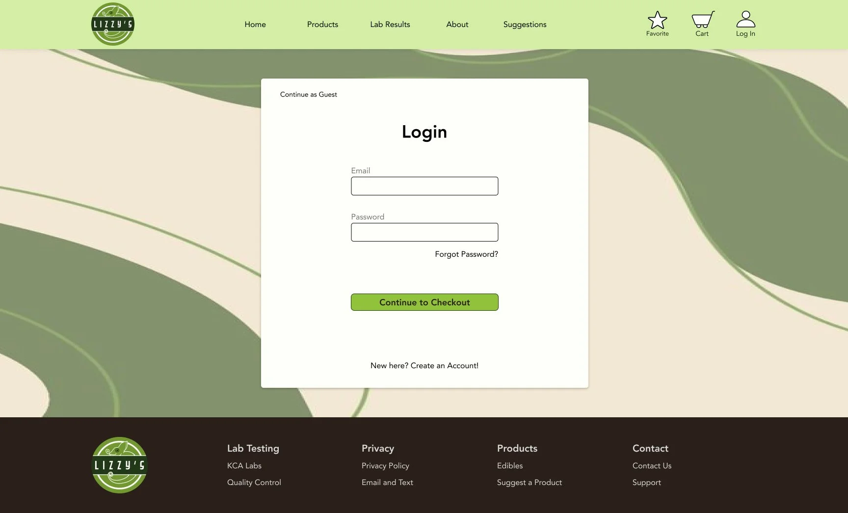
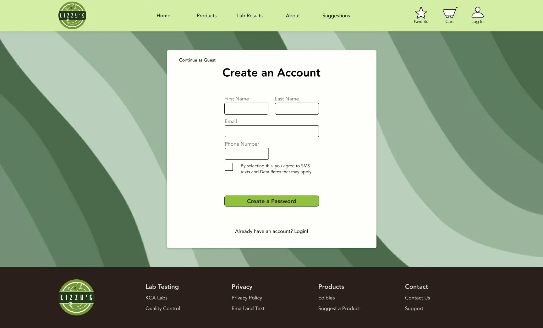
I decided to make this flow longer, because it goes about the typical e-commerce flow. The user, through this flow, is able to look at the landing page (or home screen), find the product through the home screen or products page, select the correct product and amount, and add to cart. Once in the cart, the user can then select how they want to proceed, either as guest or through logging in. They must then enter their information according to what was selected (for this flow, the only valid option is to log in to an existing account). After entering their billing and shipping information, they are ready to check out, thus ending the flow.
Branding
Style Tile
For this style tile, I wanted to capture the idea of a fun to use, informational, and trustworthy website that users feel confident navigating. I wanted users to feel comfortable with a sensitive topic, and know they are purchasing safe and clean products.
Logos and Product Mockups
Logos and product mockups were made by the Lizzy’s team, but images and the final logo created by me and finalized by the two owners. Creating a simple, easy to see logo was important because it is easy to spot and can be changed based on marketing choices.
Product Wrapper
Primary Logo
Secondary Logo
Packaging Mockup
Design and Testing
The design and testing stage was made in order to begin testing the layouts of the website and see how potential clientele feel about the layouts. It offers the unique experience of starting from the beginning, discovering what clients may want in a visual sense, rather than a general sense as was discovered in the research stage.
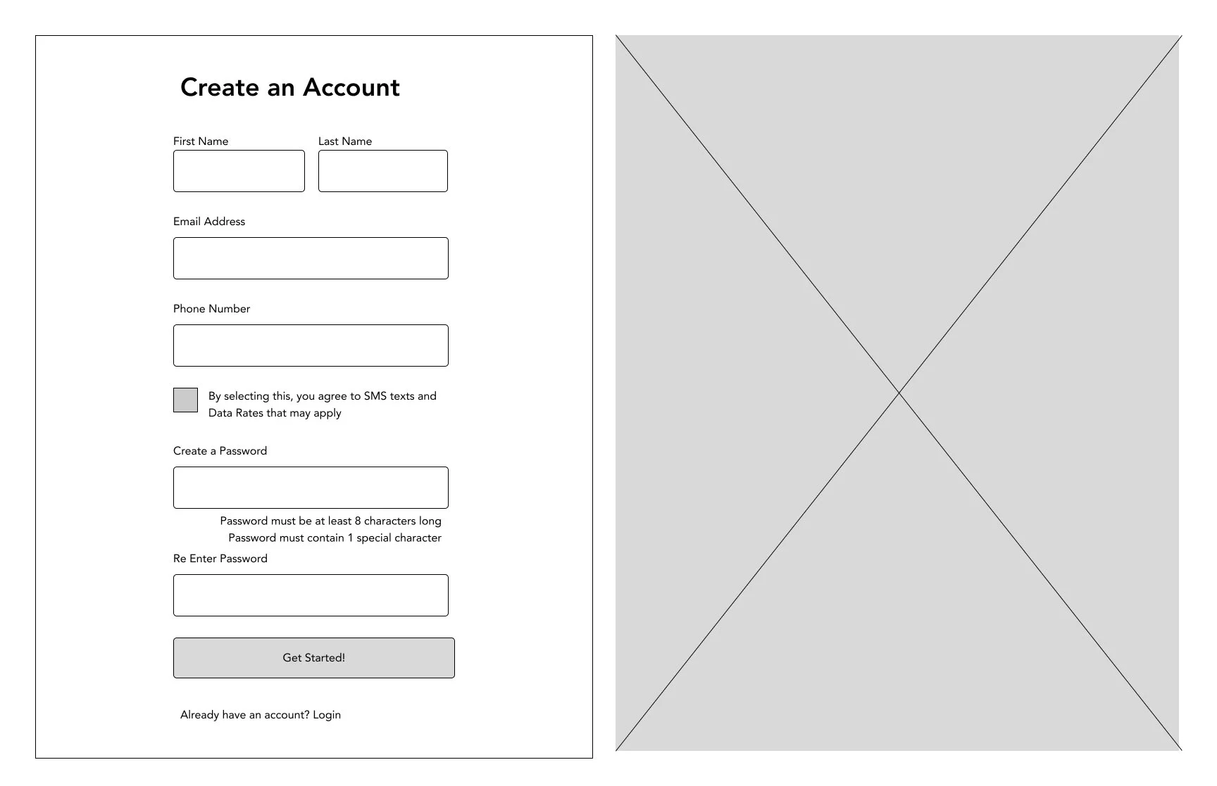
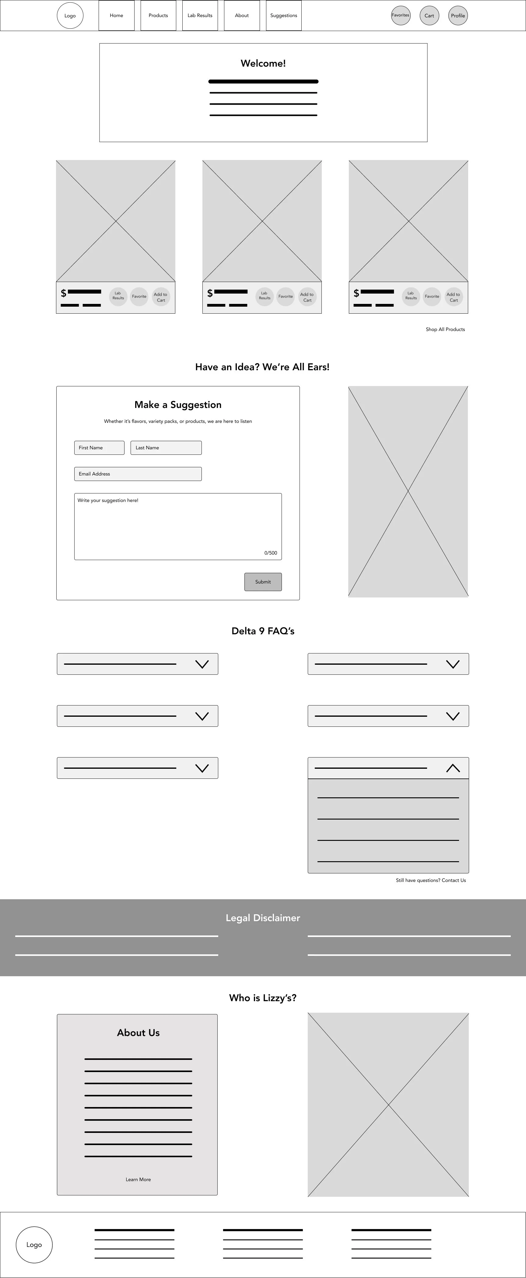
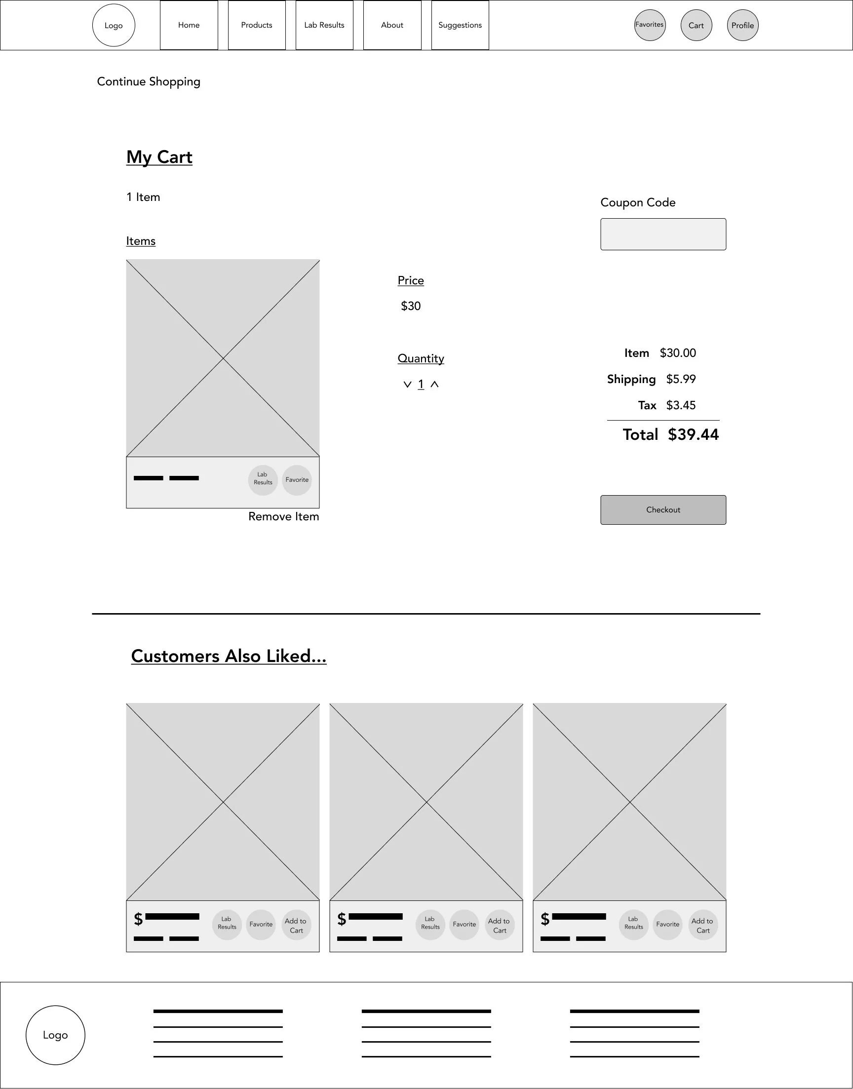
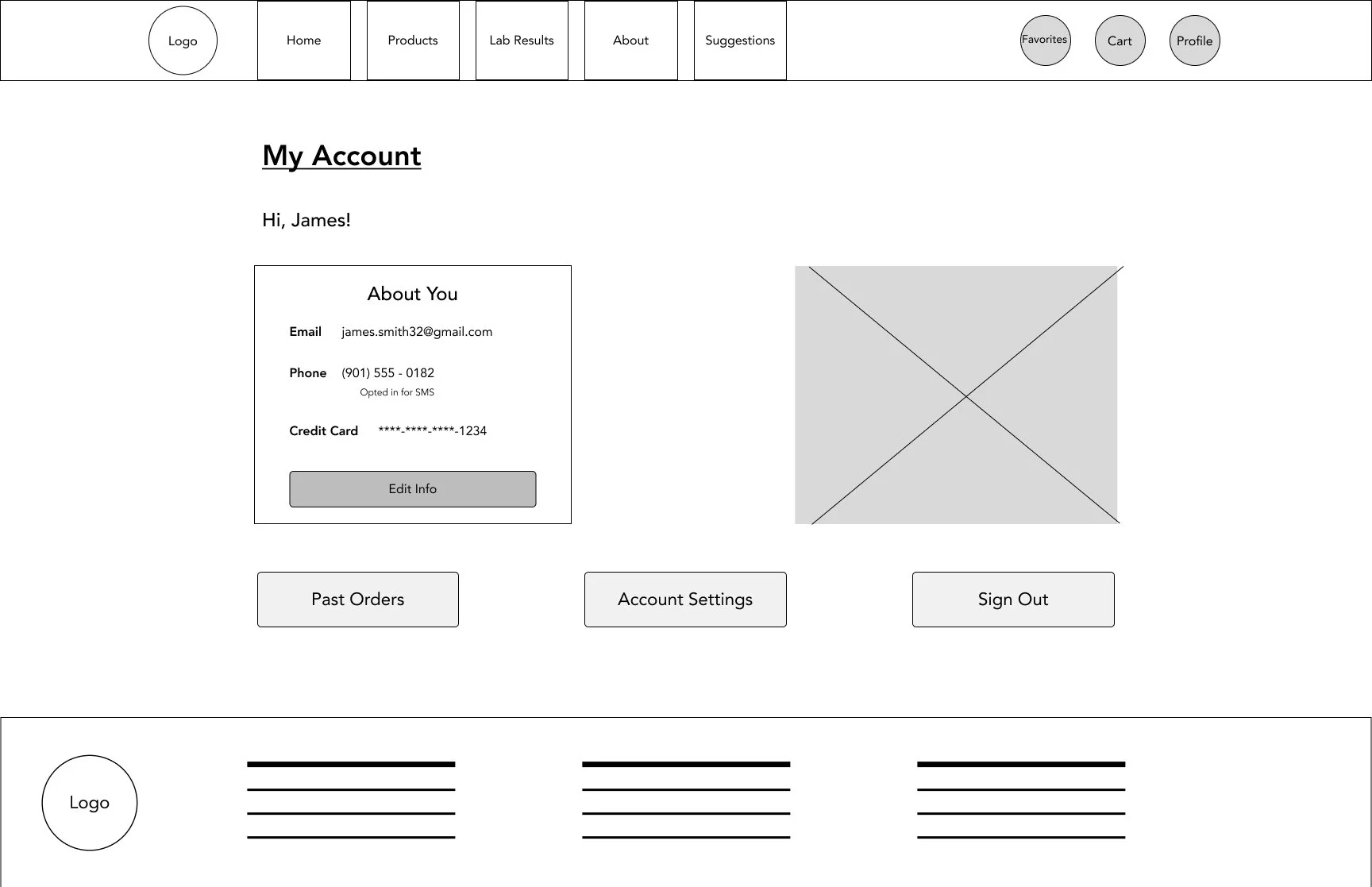
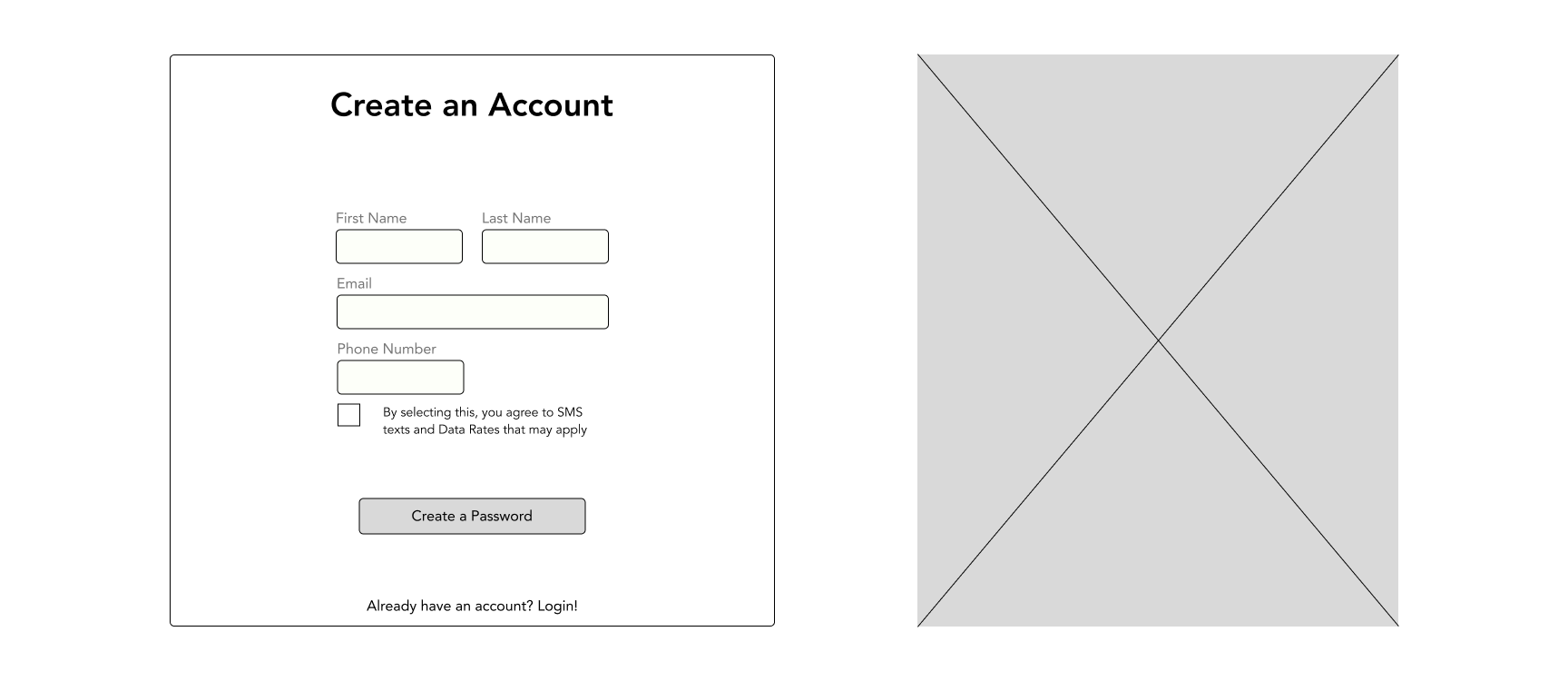
Low Fidelity Wireframes
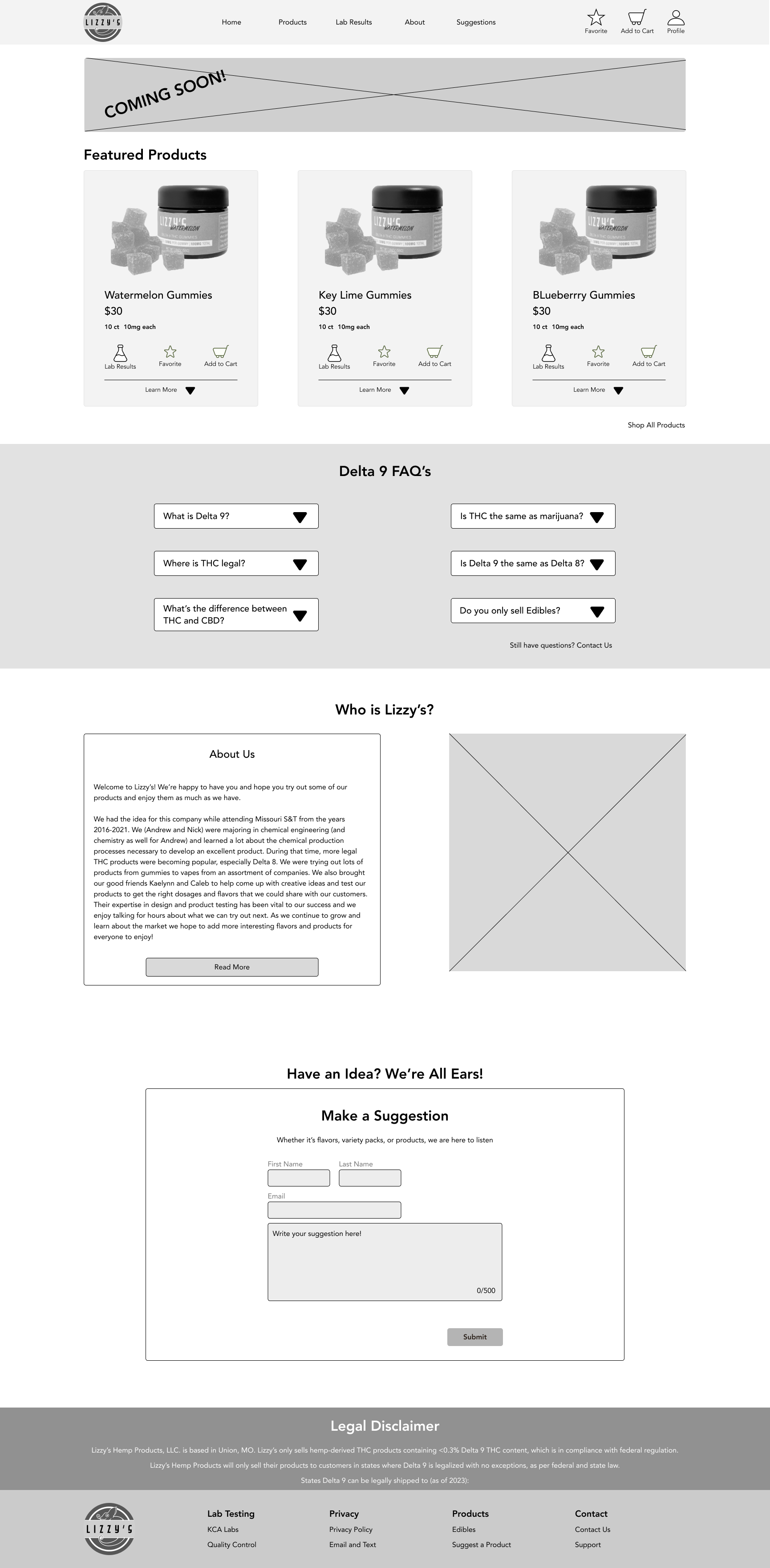
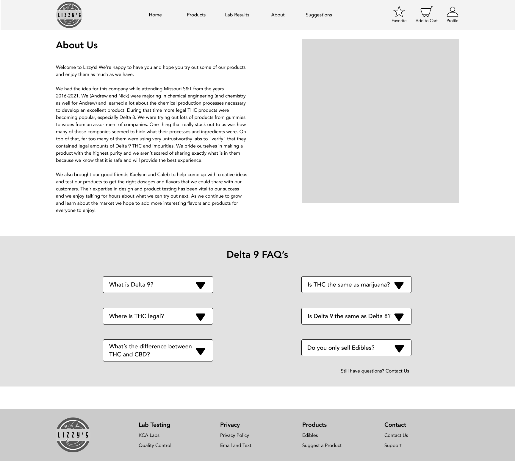
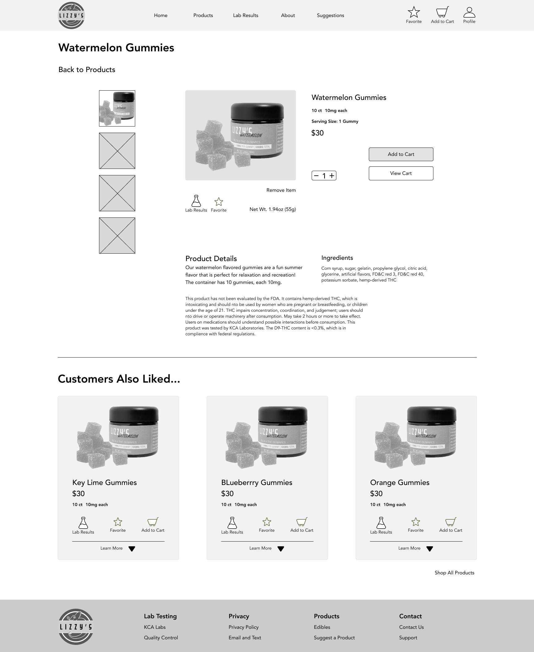
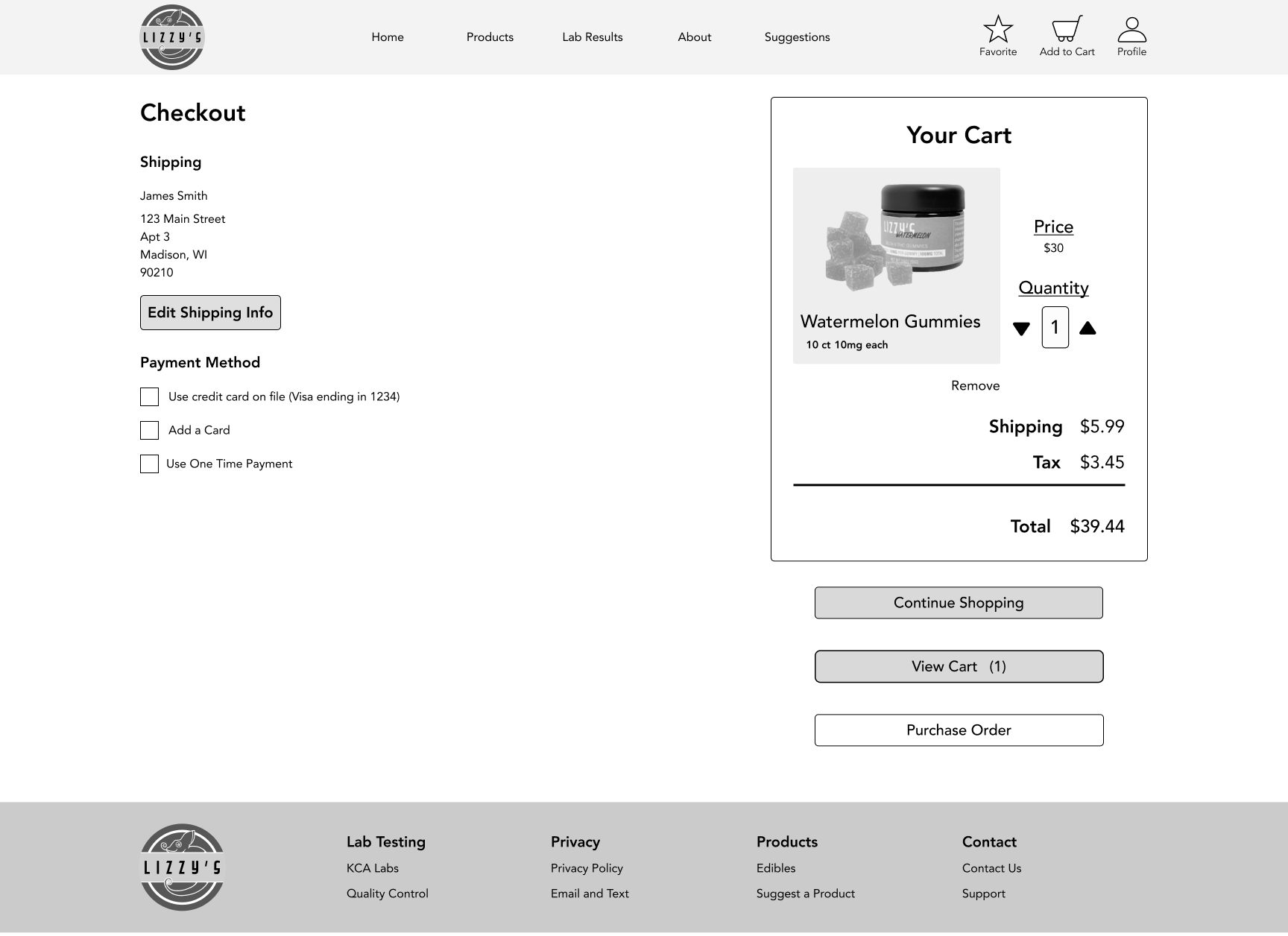
The purpose of the following layouts is to provide an easy to use, trusting website for users. Lizzy’s really focuses on transparency, information, and a rapport between users and the company.
The Delta 9 FAQ section was added because, as discovered during user interviews and research, many people don’t know the meaning of Delta 9. They also seemed to be confused about the difference between Delta 8, 9, and 10, as well as CBD and THC. Legality issues were also discussed in the FAQ’s, with a prompt to reach out if they had more questions.
The suggestion box was added to build a connection between the user and the company. Lizzy’s wants to extend a branch to their users and help them feel like they’re part of the process by suggesting potential flavors and products. Click arrows to scroll through wireframe pages.
Mid Fidelity Wireframes
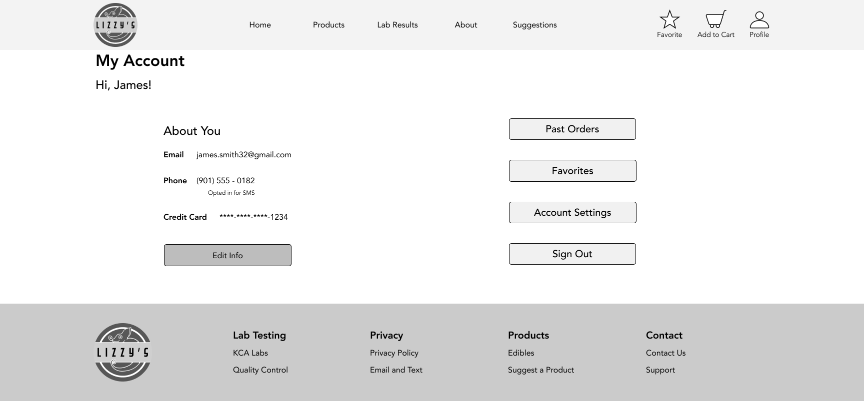
The mid fidelity wireframes were created in order to add more visuals to the website’s layouts. Adding a basic image for the product, accurate potential text, and working buttons and interactions allow potential future tests with users to plan out layout of the completed website. Only desktop layouts were created for the mid fidelity wireframes. Testing on the desktop allows the users to focus on one layout, and iterations can be made on both desktop and iPhone. Click arrows to scroll through wireframe pages.
Testing the mid-fidelity wireframes was a task that was deemed necessary to the process. Five users were selected for the tests, ages ranging from 25-63. The users were told the task, and asked to navigate the website as they would normally. After the task was completed, users were asked to look at the About Us page, as it was not part of the task but requested to be added by Lizzy’s founders. Users were asked questions regarding the website and flow after the completion of these tasks. Results are listed below.
Usability Testing- Mid Fidelity Wireframes
Key Findings
Users found the tasks to be simple and quick to complete.
Users disliked the About page, saying the information was disengaging.
Spacing was incorrect and not aligned to grid.
Buttons were either too small or too big, did not fit idea of website.
Other changes were interaction and flow based.
Iterations were made while creating the high fidelity wireframes.
High Fidelity Wireframes
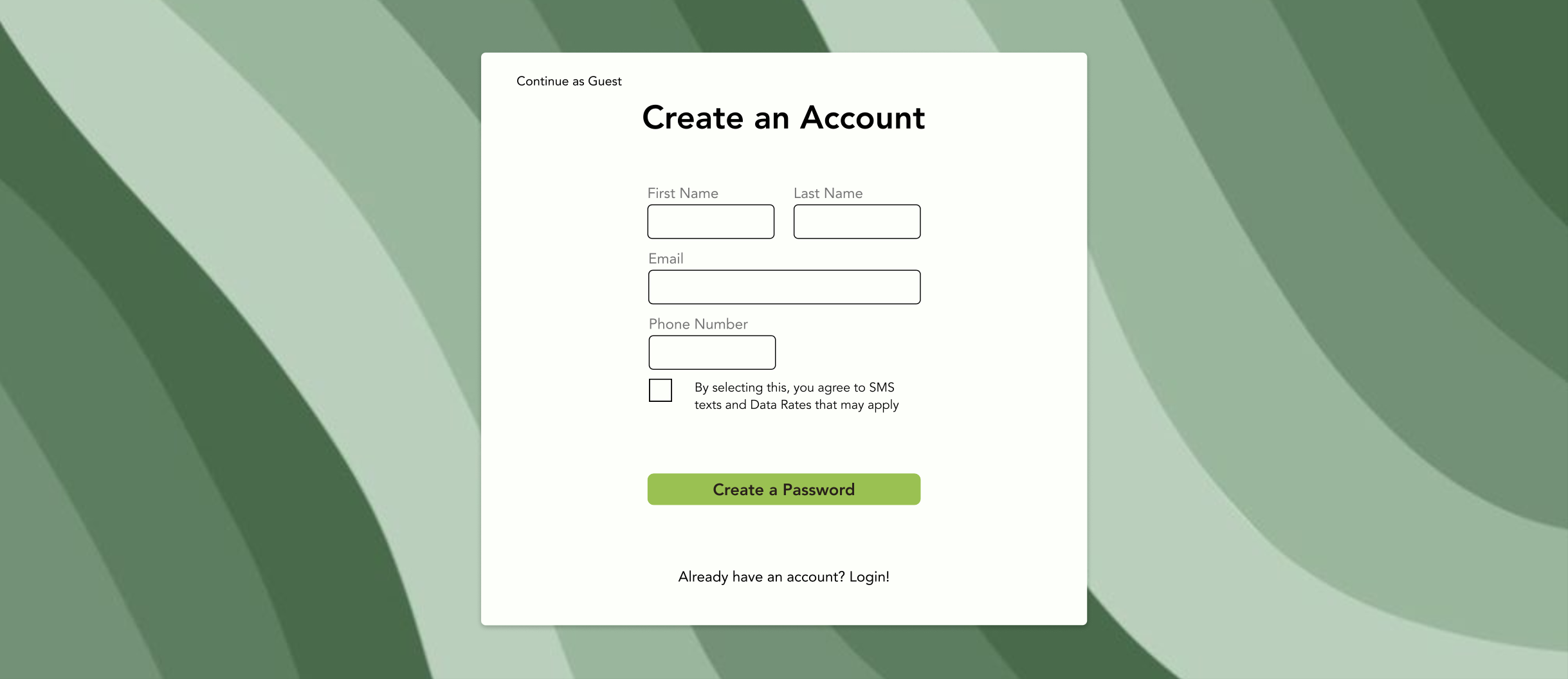
With the first iteration of the high-fidelity wireframes, only the desktop screens were created and tested.
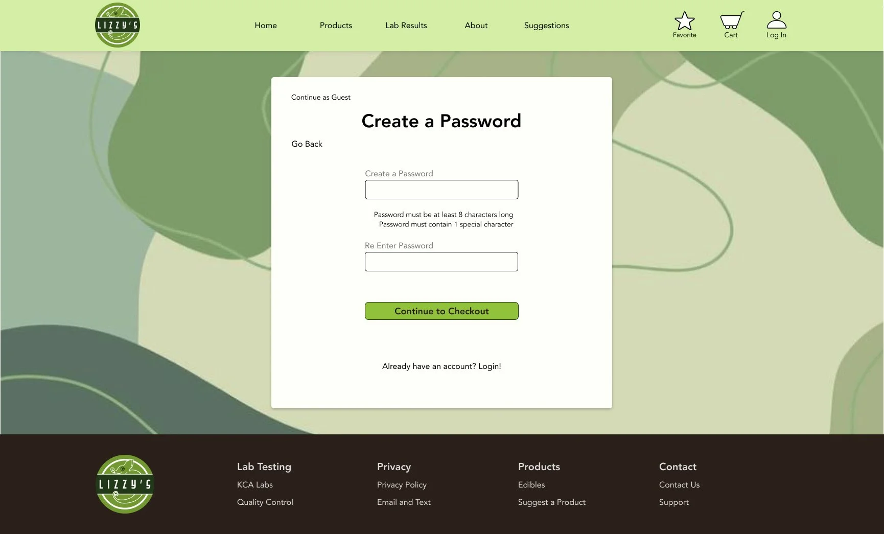
Two pages were added: Create a Password and Sign In.
Create a Password was added to alleviate the Create an Account page, as there was enough information on that page already. Dedicating a full page to password creation allows the user to pay more attention to their password and ideally eliminate some user error. Click arrows to scroll through wireframe pages.
Usability Testing- High Fidelity Wireframes
Five participants were used for testing, similar to the mid-fidelity wireframe testing. Three of the participants were the same from the mid-fidelity wireframe testing. Users were given the same task, but asked different questions focusing more on the branding, color palette, and other visual aspects that were not seen in the mid-fidelity wireframes. Results and findings can be found below.
Key Findings
Users found the tasks to be simple and quick to complete
Users responded overwhelmingly positive to the color palette
Some users disliked the picture on the about page, while others liked the goofy quality
Only small format changes were requested
Iterations
Iteration 1: Main Logo
Logo on the header has been replaced with the main logo. It came to my attention that the title was not on the page, so having the main logo with “Lizzy’s” on the header helps with users knowing where they are.
Before
After
Iteration 2: Featured Products
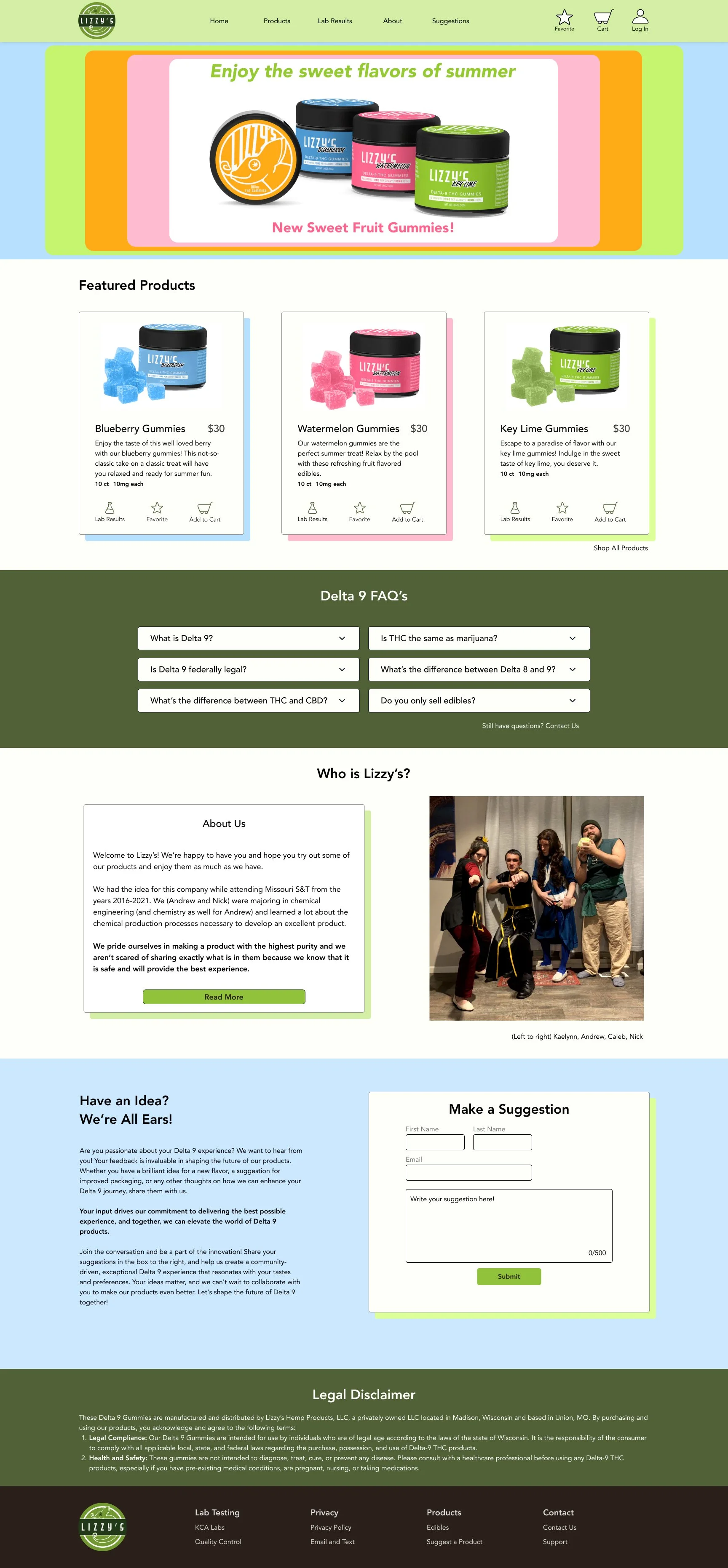
Featured products were in random color order, but they are now in the order of the colors on the “Welcome” message. This is a small visual change, but makes the first page more cohesive and fit together.
Before
After
Iteration 3: About Us
The “About Us” section is much shorter and easier to read. Users found it tedious and did not finish reading. Now they find it easier to see after removing unnecessary information.
Before
After
Iteration 4: Checkout Cart
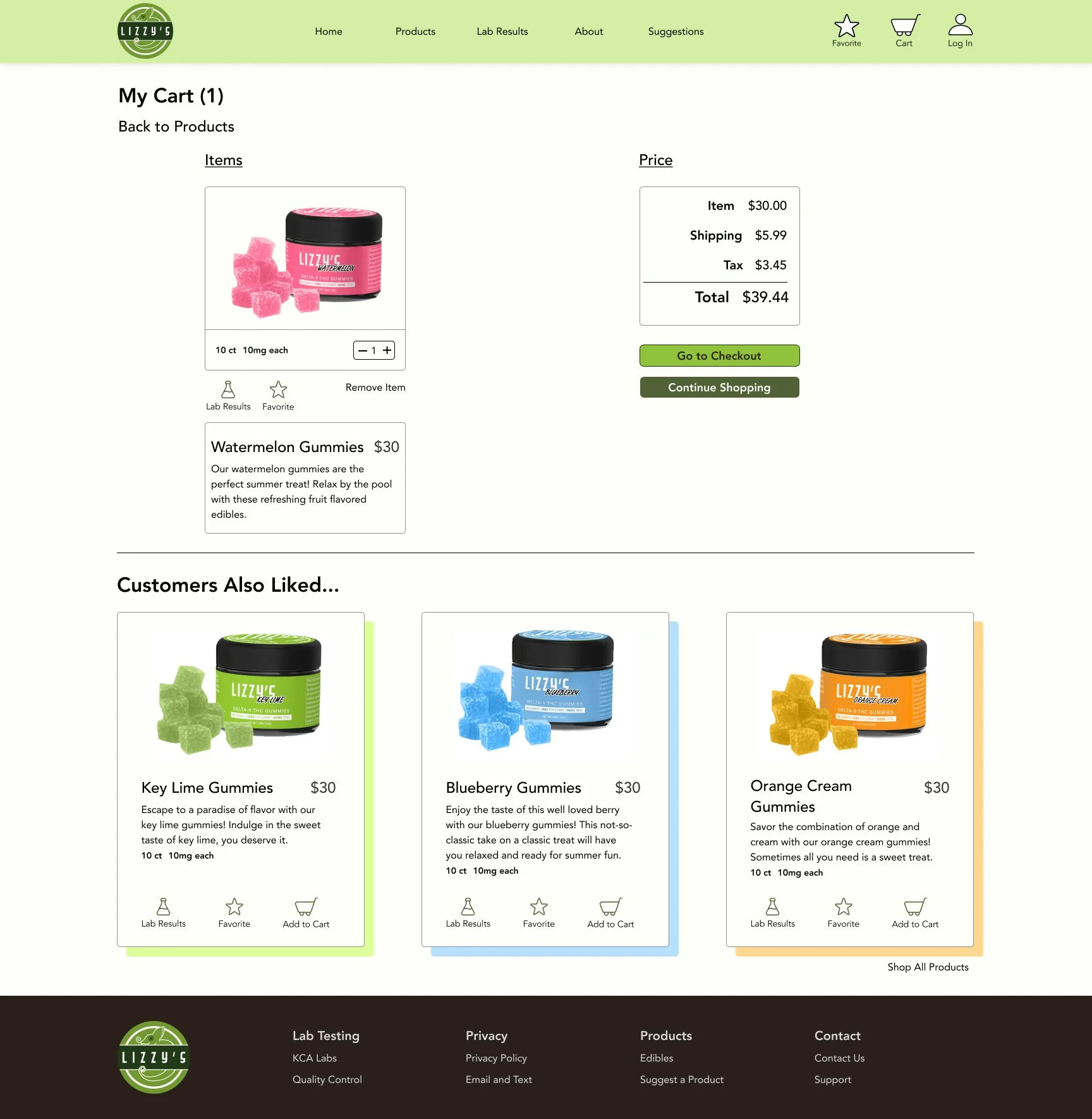
The size of the checkout cart is now grouped in an easier-to-see manner. Grouping the product in one box and aligning the rest of the checkout cart with the product box makes the UI easier to understand and see at a glance.
Before
After
Iteration 5: Save Shipping Information
The shipping info button is now a checkmark instead of a button. This fits with the rest of the UI on the page as it is the same checkbox as seen in other prompts on the page, and allows the user to change their mind and uncheck the box if they don’t want to save their information.
Before
After
Iteration 6: Shipping Confirmation
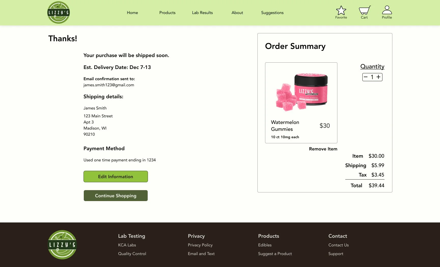
Email confirmation was added so the user is sure where the receipt is being sent. This makes sure the user knows they have gotten a receipt, as well as used the correct email account.
Before
After
High Fidelity Wireframes- Final Iterations
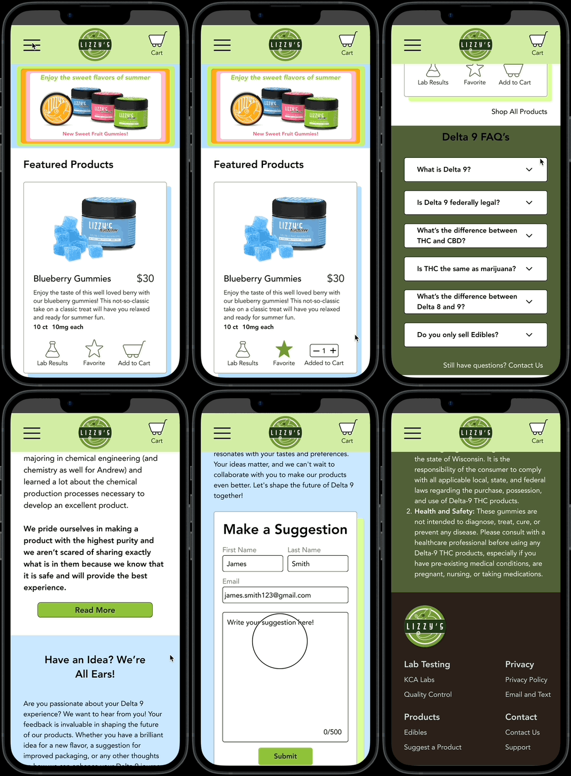
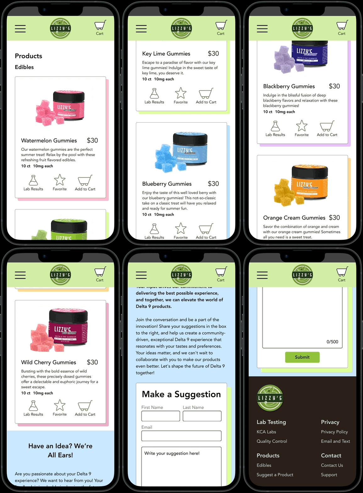
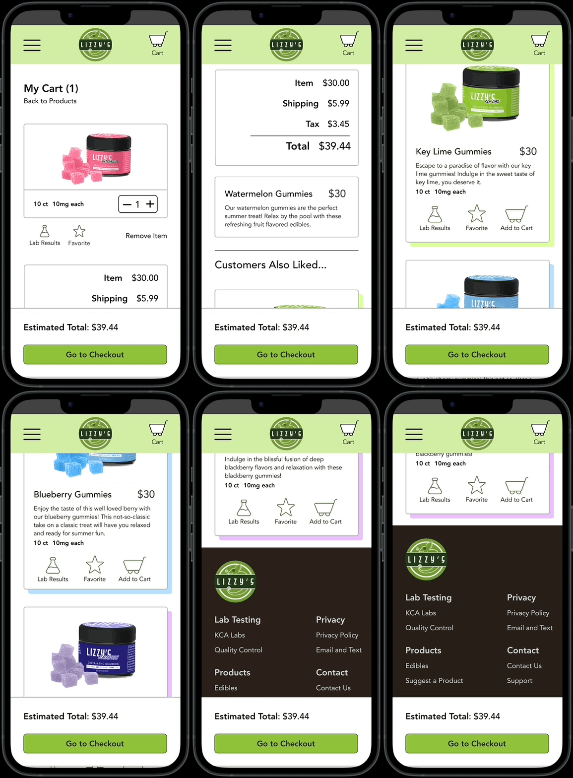
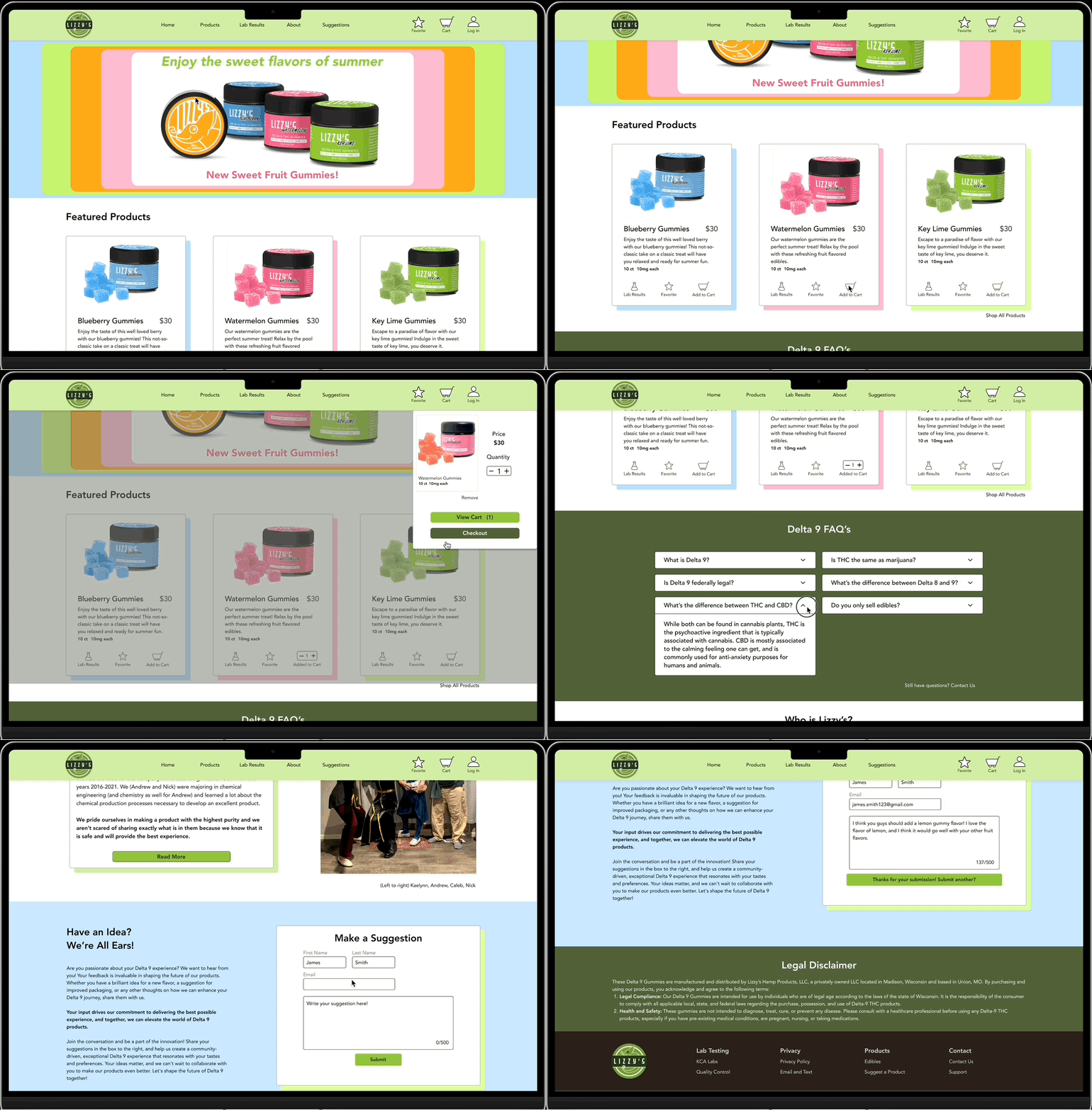
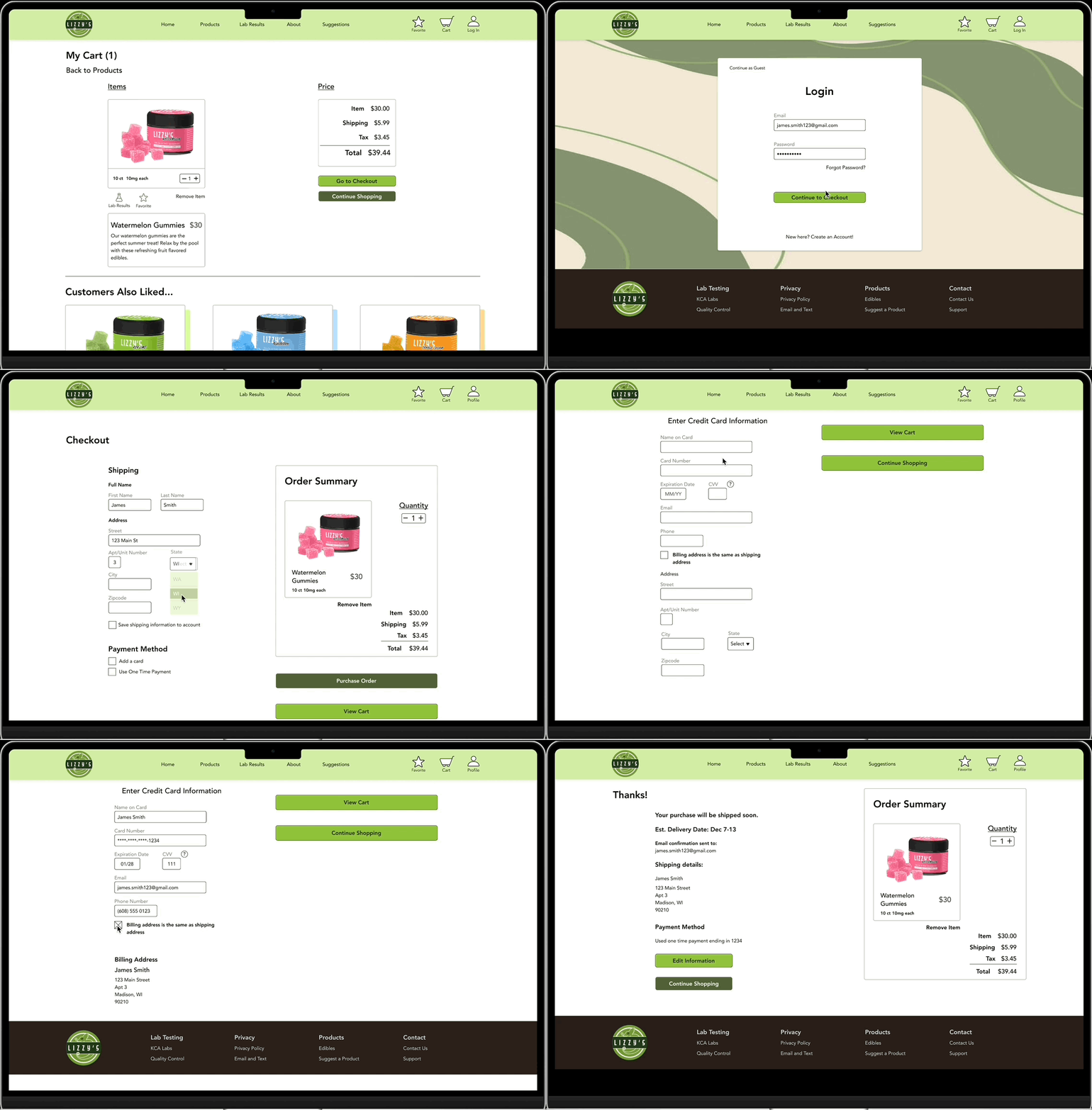
The final iterations of the high-fidelity wireframes consist of both iPhone 14 screens and desktop screens. Feedback from the usability tests, user research, and iterations came into consideration when creating these final screens. The company was very pleased with these screens, and had no additional notes. Click arrows to scroll through wireframe pages.
Conclusion
Working with a team was a very different process. Weekly meetings, scheduling, and organizing everything in specific manners in Google Drive was a challenge, but one that was met well on both ends.
With more time, I would like to create more pages and test this website out with actual clients.
In the end, I believe I captured what Lizzy’s was wanting from their brand.


